Last Updated on March 16, 2026
In this tutorial, you’ll learn how to build a complete customer churn analysis and forecasting dashboard in Microsoft Power BI.
Starting with simple CSV datasets, we’ll gradually design a robust data model, create calculated columns and DAX measures, and build interactive visuals that reveal customer behavior in detail.
You’ll also explore monthly and annual churn trends, analyze retention by cohort, and build forecasts that project customer growth and revenue under different scenarios.
🔎 You can preview the interactive dashboard at the end of this tutorial to follow along.
Table of Contents
Step 1. Load and Transform Customer Data
The foundation of customer churn and forecasting analysis in Microsoft Power BI is having clean, structured data. For this tutorial, we’ll work with four CSV files representing signups, cancellations, pricing plans, and customer details.
These datasets form the backbone of the Power BI data model, enabling churn calculations, cohort analysis, and eventually customer growth forecasts.
For this Customer Churn Analysis and Forecast Dashboard, I used the following source files:
- cancellations_data – records each cancellation event with a unique
customer_idandcancellation_date. - customer_lookup – contains key customer details such as
customer_id,first_name,last_name, andemail. - pricing_plan_lookup – maps
pricing_planvalues to theirmonthly_price. - signups_data – tracks each signup with
customer_id,signup_date, and chosenpricing_plan.
📥 You can download the source files and the completed Power BI dashboard file at the end of this tutorial.
To import these files, open a new blank Power BI project, go to the Home tab, and select Get Data → Text/CSV.
When loading a file, you can either import it directly or select Transform Data to open Power Query.
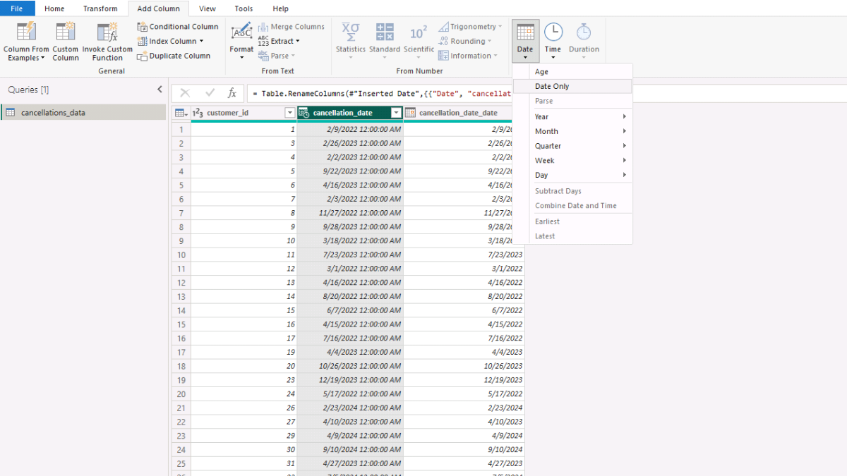
In our case, both the cancellation and signup dates are loaded as Date/Time fields. To standardize them as dates only, add a calculated column in Power Query: select the column (cancellation_date or signup_date), go to the Add Column tab, choose Date → Date only, and rename the new fields to cancellation_date_date or signup_date_date.
Once the data looks correct, return to the Home tab and click Close & Apply.
Repeat this process for all four CSV files until they appear in the Fields pane. While this tutorial uses flat files for simplicity, Microsoft Power BI supports a wide range of sources, including SQL Server, Excel, and cloud databases.
Step 2. Create an Autogenerated Calendar Table
Every effective Power BI data model needs a calendar table. Without it, you can’t properly track customer signups, cancellations, or calculate churn rates over time.
Instead of manually maintaining a date range, we’ll create a dynamic calendar table that automatically adjusts to the earliest and latest dates in our datasets — and extends five years beyond, so it can also support customer growth and revenue forecasts.
To build the table, go to the Table view in Microsoft Power BI (left sidebar). Click Table tools → New table. In the Formula bar, give your table a name (for example, Calendar), type the equal sign, and paste the DAX code shown below.
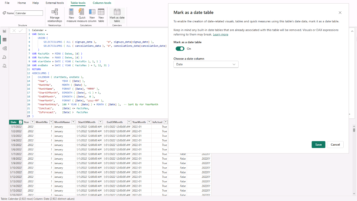
This DAX script generates a complete calendar that starts at the first signup or cancellation date, extends up to five years past the last event, and enriches each date with useful attributes such as year, month, month names, YearMonth keys, and start/end of month fields. It also introduces flags to distinguish actuals from forecast periods, which we’ll need later for projecting customer churn and revenue.
Calendar =
VAR Dates =
    UNION (
        SELECTCOLUMNS ( ALL ( signups_data ),       "d", signups_data[signup_date] ),
        SELECTCOLUMNS ( ALL ( cancellations_data ), "d", cancellations_data[cancellation_date] )
    )
VAR factsMin  = MINX ( Dates, [d] )
VAR factsMax  = MAXX ( Dates, [d] )
VAR startDate = DATE ( YEAR ( factsMin ), 1, 1 )
VAR endDate   = DATE ( YEAR ( factsMax ) + 5, 12, 31 )
RETURN
ADDCOLUMNS (
    CALENDAR ( startDate, endDate ),
    "Year",          YEAR ( [Date] ),
    "MonthNo",       MONTH ( [Date] ),
    "MonthName",     FORMAT ( [Date], "MMMM" ),
    "StartOfMonth",  EOMONTH ( [Date], -1 ) + 1,
    "EndOfMonth",    EOMONTH ( [Date],  0 ),
    "YearMonth",     FORMAT ( [Date], "yyyy-MM" ),
    "YearMonthKey",  100 * YEAR ( [Date] ) + MONTH ( [Date] ),  -- Sort By for YearMonth
    "IsActual",      [Date] <= factsMax,
    "IsForecast",    [Date] >  factsMax
)
Finally, make sure to click Mark as date table so Microsoft Power BI treats it as the official calendar. This ensures that all your time-based calculations, including churn analysis and forecasting, will work correctly.
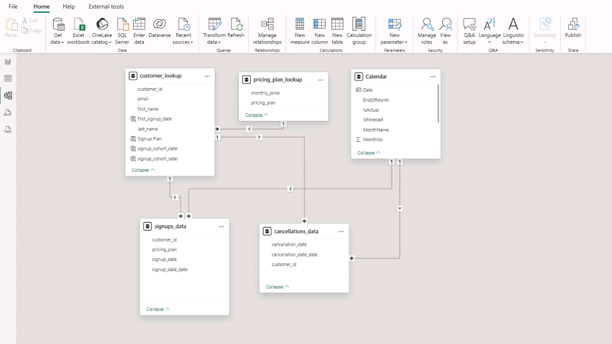
Step 3. Define Relationships Between Tables
A well-structured data model is at the heart of any reliable Power BI churn or customer growth analysis. Relationships allow Microsoft Power BI to connect your tables correctly so that calculations like churn rate, retention, and revenue forecasts are based on accurate joins.
In practice, this means starting with the customer_lookup as the central reference. Its customer_id acts as the primary key, which links to the customer_id columns in the signups_data and cancellations_data tables, where they act as foreign keys. This setup ensures that every signup or cancellation event is tied back to the correct customer.
To establish these links, go to the Model view in Microsoft Power BI (left sidebar). Each table will appear as a rectangle listing its fields. Drag customer_lookup[customer_id] to cancellations_data[customer_id]. A dialog box will appear showing the relationship details. Set the cardinality to One-to-many (1:*)* and choose Single for the cross-filter direction. Ensure the relationship is active, then click Save.
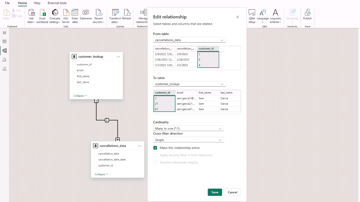
Next, repeat the process for the other necessary relationships:
- customer_lookup → signups_data (customer_id).
- Calendar → cancellations_data (Calendar[Date] to cancellations_data[cancellation_date]).
- Calendar → signups_data (Calendar[Date] to signups_data[signup_date]).
With all links established, your Power BI model is ready to support customer churn and cohort analysis.
Step 4. Create Calculated Columns for Customer Cohort Analysis
To complete the preparation of our data model, we need to enrich the customer_lookup table with additional calculated columns. These columns will allow us to group users into signup cohorts, which is key for analyzing churn and customer retention trends in Microsoft Power BI.
The first step is to capture the first signup date for each customer. This is done by checking the customer’s earliest record in the signups_data table. In Microsoft Power BI, use New column (right-click on customer_lookup → New column) and insert the DAX code below.
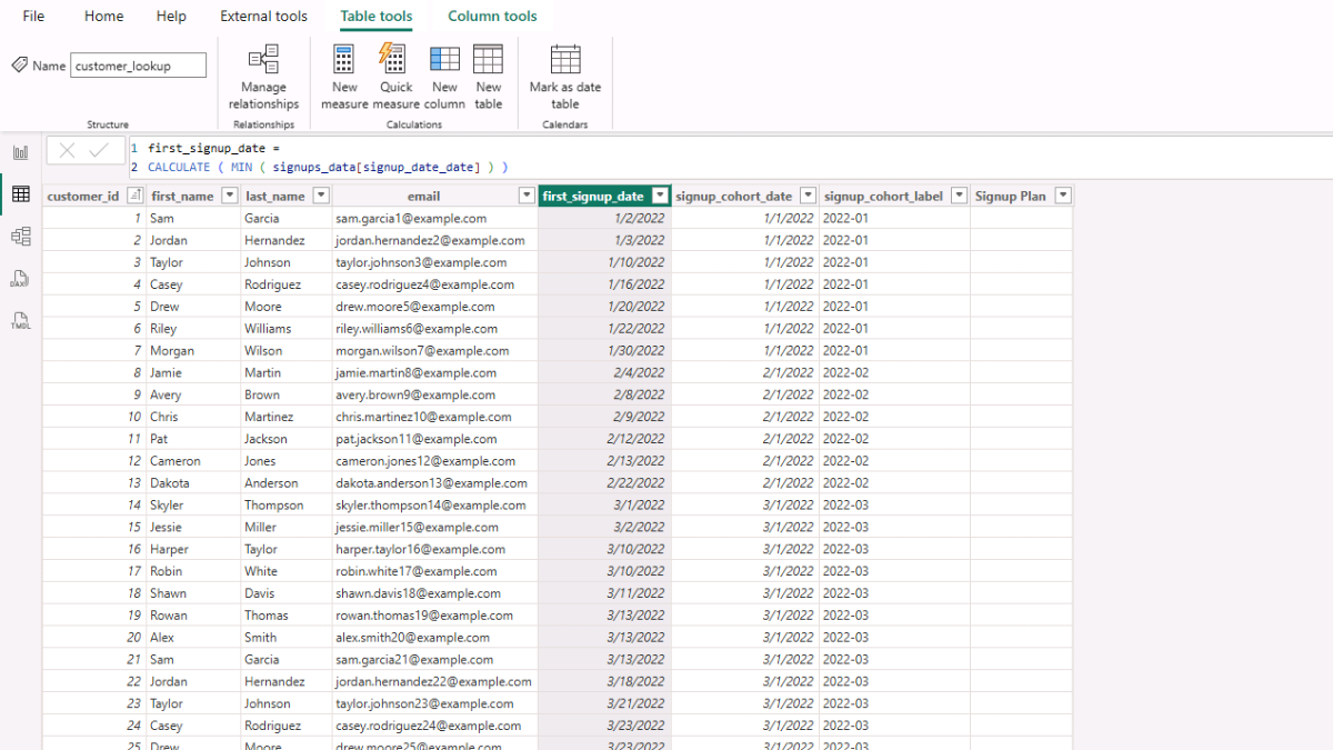
first_signup_date = CALCULATE ( MIN ( signups_data[signup_date_date] ) )Next, normalize this date to the first day of the month so that all customers who signed up in the same period are grouped together.
signup_cohort_date = EOMONTH ( [first_signup_date], -1 ) + 1From there, create a cohort label in the format YYYY-MM to make reporting easier.
signup_cohort_label = FORMAT ( [signup_cohort_date], "yyyy-MM" )Finally, capture the signup plan a user chose at their first signup. This connects each customer to their initial subscription plan.
Signup Plan =
VAR firstSignup = [first_signup_date]
RETURN
CALCULATE (
    SELECTEDVALUE ( signups_data[pricing_plan] ),
    signups_data[signup_date_date] = firstSignup
)
At this point, update the data model so that pricing_plan_lookup[pricing_plan] has a one-to-many relationship with customer_lookup[Signup Plan]. This ensures that pricing plans can be used in filters, slicers, and visuals later.
With these calculated columns and relationships in place, the model is now ready to support more advanced churn analysis.
Step 5. Create DAX Measures for Customer Churn Analysis
With our data model and calculated columns in place, we can now build the first set of measures that will power customer churn analysis in Microsoft Power BI. The signups_data and cancellations_data tables tell us when customers joined and when they left. From these, we can calculate active customer counts, churn rates, and growth patterns over time.
To stay organized, start by creating a dedicated Measures table. In the Home tab, click Enter Data, give it the name Measure Table, and click Load. You’ll now see a new table in the Fields pane. Right-click it and select New Measure to begin adding your DAX calculations.
Step 5a. Core Customer Churn Measures
The first measure sets the cutoff date across both signups and cancellations. This is essential because it defines the point at which your historical data ends and where forecasts begin.
Actual - Facts Max Date =
MAX (
    CALCULATE ( MAX ( signups_data[signup_date_date] ), ALL ( signups_data ) ),
    CALCULATE ( MAX ( cancellations_data[cancellation_date_date] ), ALL ( cancellations_data ) )
)
Next, calculate new signups and churned customers. These two measures capture the inflows and outflows of customers in any given period.
Actual - New Signups = DISTINCTCOUNT ( signups_data[customer_id] )Actual - Churned Customers = DISTINCTCOUNT ( cancellations_data[customer_id] )To monitor long-term growth, create cumulative totals for signups and cancels. These measures act like running tallies, showing the overall trajectory of customer acquisition and attrition.
Actual - Cum Signups =
VAR d = MAX ( Calendar[Date] )
RETURN
CALCULATE (
    DISTINCTCOUNT ( signups_data[customer_id] ),
    ALL ( Calendar[Date] ),
    Calendar[Date] <= d
)
Actual - Cum Cancels =
VAR d = MAX ( Calendar[Date] )
RETURN
CALCULATE (
DISTINCTCOUNT ( cancellations_data[customer_id] ),
ALL ( Calendar[Date] ),
Calendar[Date] <= d
)
)From here, you can compute active customers by subtracting cumulative cancels from cumulative signups. This tells you how many customers remain in your base at any point in time.
Actual - Active Customers = [Actual - Cum Signups] - [Actual - Cum Cancels]The beginning-of-month active (BOM Active) measure is especially important. It represents the active base at the start of a period, before new signups and cancellations are applied. This figure is critical because it forms the denominator for churn rate.
Actual - BOM Active =
[Actual - Active Customers]
  - [Actual - New Signups]
  + [Actual - Churned Customers]
Finally, calculate churn rate, the percentage of customers lost during a period. This metric is one of the most important indicators of customer health and retention.
Actual - Churn Rate = DIVIDE ( [Actual - Churned Customers], [Actual - BOM Active] )Step 5b. Organizing and Formatting DAX Measures
At this stage, clean up your workspace by deleting the empty column automatically created in the Measure Table (right-click → Delete from model). For better readability, set the Actual – Churn Rate measure’s Format = Percentage (with one decimal place). You can also group all of these measures into a folder called Actual by editing the Display folder property in the Model view.
With these measures in place, you now have the core building blocks to track customer signups, cancellations, active base, and churn rate in Microsoft Power BI. In the next step, we’ll put them to work in visuals.
Step 6. Visualizing Customer Signups, Cancellations, and Churn in Microsoft Power BI
Now that we have the key measures, we can turn them into Power BI visuals that reveal customer growth patterns and churn dynamics. Visualizations let you move beyond raw numbers to spot trends, seasonality, and risks at a glance.
Start by switching to the Report view (left sidebar). From the Insert tab, select Matrix. This blank visual has placeholders for Rows, Columns, and Values.
Step 6a. Building a Monthly View
Drag Calendar’s YearMonth field into Rows. Then add the following measures into Values:
- Actual – New Signups (shows inflows of customers)
- Actual – Churned Customers (shows outflows)
- Actual – Active Customers (net customer base each month)
- Actual – Churn Rate (percentage of the base lost)
This gives you a month-by-month breakdown of customer health, where you can quickly see periods of strong acquisition or worrying churn spikes.
Step 6b. Building an Annual View
For a higher-level perspective, insert another Matrix. This time, drag Calendar’s Year into Rows and add:
- Actual – BOM Active (opening base of active customers)
- Actual – New Signups
- Actual – Churned Customers
- Actual – Active Customers
This provides a yearly summary of growth and churn, which is useful for board-level reporting or long-term strategy reviews.
Step 6c. Adding Filters with Slicers
To make the report interactive, add slicers. Insert a Slicer visual, drag Year from the Calendar table, and rename the header to Select Year. Change its style under Slicer settings (e.g., Between for a slider or Dropdown for quick selection).
Next, add another slicer for pricing_plan_lookup’s pricing_plan. Choose Vertical list so you can select one or multiple plans. These slicers let you zoom in on specific time periods or customer segments, enabling more targeted analysis.
Step 6d. Adding a Combined Chart
Finally, insert a Line and Clustered Column Chart. Drag Calendar’s StartOfMonth into the X-axis, Actual – New Signups into the Column Y-axis, and Actual – Churn Rate into the Line Y-axis. This dual-axis chart shows both customer acquisition volume and churn dynamics in one place, highlighting whether periods of rapid growth are sustainable.
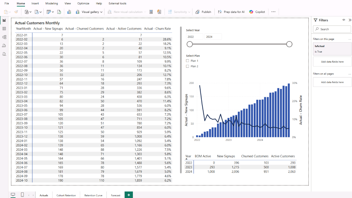
At this point, you have a core customer churn dashboard in Microsoft Power BI. The monthly and yearly matrices reveal customer flows, the slicers make analysis interactive, and the chart shows the relationship between new signups and churn. Together, they give you both the big picture and granular details of customer health.
Step 7. Analyzing Customer Churn and Retention by Cohort
While the monthly and annual views give you a sense of overall churn trends, they don’t explain how individual groups of customers behave over time. That’s where cohort analysis comes in. A cohort groups customers by their signup month and year, allowing you to see how long each group stays active and when they tend to cancel.
This is one of the most powerful ways to analyze retention in Microsoft Power BI, because it reveals patterns that aggregate churn rates often hide.
For example, imagine that 100 customers signed up in January 2022. By tracking that group through subsequent months, you can see how many are still active in February, March, April, and so on. Comparing cohorts side by side shows whether newer signups churn faster than older ones, or if certain months had unusually strong retention.
Step 7a. Creating the Cohort Age Table
Before we can calculate retention measures, we need a Cohort Age table. This table holds values from 0 to 60, representing the number of months since a customer’s signup date. By combining this with the signup cohort, we can evaluate retention at each stage of the customer lifecycle.
To create it, switch to Table view, go to Table tools, click New table, and enter the following DAX:
Cohort Age = GENERATESERIES ( 0, 60, 1 )This will create a simple numeric series where each value represents the number of months since signup. You’ll use it in combination with the cohort measures below to build retention matrices and charts.
Step 7b. Customer Cohort Retention DAX Measures
Now we can define the measures that calculate cohort size, cumulative cancellations, active customers by cohort age, and retention percentage.
Actual – Cohort Size (Matrix): Counts the number of customers in the selected cohort.
Actual - Cohort Size (Matrix) = DISTINCTCOUNT ( customer_lookup[customer_id] )Actual – Cancels To Date (Cohort): Counts how many customers in a cohort canceled by a given age (in months).
Actual - Cancels To Date (Cohort) =
VAR cohortStart     = SELECTEDVALUE ( customer_lookup[signup_cohort_date] )
VAR age             = SELECTEDVALUE ( 'Cohort Age'[Value] )
VAR cutoffExclusive = EDATE ( cohortStart, age )
RETURN
IF (
    ISBLANK ( cohortStart ) || ISBLANK ( age ) || age = 0,
    0,
    CALCULATE (
        DISTINCTCOUNT ( cancellations_data[customer_id] ),
        KEEPFILTERS ( VALUES ( customer_lookup[customer_id] ) ),
        REMOVEFILTERS ( Calendar ),
        cancellations_data[cancellation_date_date] < cutoffExclusive
    )
)
Actual – Active at Age (Matrix): Shows how many customers from a cohort remain active at a given age.
Actual - Active at Age (Matrix) =
VAR size           = [Actual - Cohort Size (Matrix)]
VAR cohortStart    = SELECTEDVALUE ( customer_lookup[signup_cohort_date] )
VAR age            = SELECTEDVALUE ( 'Cohort Age'[Value] )
VAR boundary       = EDATE ( cohortStart, age )
VAR lastActualDate = [Actual - Facts Max Date]
RETURN
IF (
    NOT ISBLANK ( cohortStart ) && NOT ISBLANK ( age ) && ( boundary - 1 ) <= lastActualDate,
    IF ( age = 0, size, MAX ( 0, size - [Actual - Cancels To Date (Cohort)] ) )
)
Actual – Retention % (Matrix): Calculates the retention rate as a percentage of the original cohort.
Actual - Retention % (Matrix) =
DIVIDE ( [Actual - Active at Age (Matrix)], [Actual - Cohort Size (Matrix)] )
With the Cohort Age table and these measures in place, you are ready to visualize retention by cohort. This will allow you to answer questions such as: Do customers acquired during rapid growth periods churn faster? or Which pricing plans have stronger long-term retention?
Step 8. Creating a Customer Retention Heatmap in Microsoft Power BI
With the Cohort Age table and retention measures in place, we can now visualize how each signup cohort performs over time. Start by adding a new page in your Power BI project and insert a Matrix visual. In the Rows, drag customer_lookup[signup_cohort_label]. In the Columns, place Cohort Age[Value].
Finally, for the Values, add the Actual - Retention % (Matrix) measure. You should now see a matrix where each row represents a signup cohort, each column represents the number of months since signup, and each cell displays the percentage of customers still active at that stage.
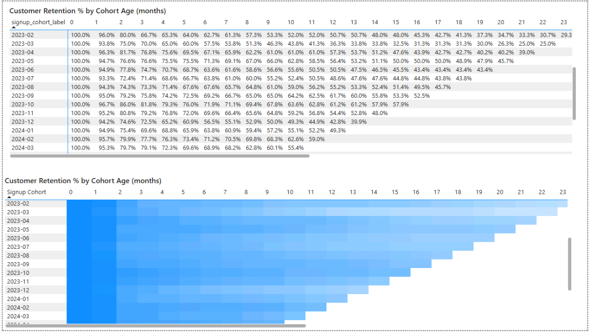
To turn this into a heatmap, select the matrix and open the Format pane on the right sidebar. Under Cell elements, click the fx icons next to Background color and Font color. Choose a gradient—for example, white for the minimum value and blue for the maximum. Apply the same setting to both background and font.
The result is a clear heatmap where darker shades represent higher retention in the early months and the color gradually fades toward white as more users cancel the service. This visual immediately highlights how retention decays over time, making it easy to compare patterns between cohorts. Hover over any cell to see the exact retention percentage in a tooltip.
Finally, consider adding slicers to make the analysis more flexible. For example, use pricing_plan_lookup[pricing_plan] as a vertical list so you can analyze retention by pricing plan, much like in the earlier monthly and annual churn analysis.
Step 9. Analyzing Customer Trends Rate with Retention Curves
The cohort heatmap gives a clear overview of retention trends, but sometimes you want to highlight how retention evolves month by month across pricing plans. A retention curve makes this easier by plotting retention percentages as lines or areas, so you can directly compare trends.
Start by creating two additional DAX measures:
Actual – Cohort Size at Age (Curve): Returns the size of a cohort when contributing to the curve. If there are no active-at-age values, it outputs 0.
Actual - Cohort Size at Age (Curve) =
SUMX (
    VALUES ( customer_lookup[signup_cohort_date] ),
    VAR contrib = [Actual - Active at Age (Matrix)]
    RETURN IF ( ISBLANK ( contrib ), 0, [Actual - Cohort Size (Matrix)] )
)
Actual – Retention % (Curve): Calculates the retention percentage as active customers divided by cohort size at a given age.
Actual - Retention % (Curve) =
DIVIDE ( [Actual - Active at Age (Curve)], [Actual - Cohort Size at Age (Curve)] )
With these measures in place, insert an Area chart in Report view. Use Cohort Age[Value] as the X-axis, place Actual - Retention % (Curve) on the Y-axis, and add pricing_plan_lookup[pricing_plan] to the Legend. This setup shows how retention curves differ across plans, revealing whether some pricing tiers retain customers longer than others.
To make the visual interactive, go to the Format pane and enable the Zoom slider on the X-axis, allowing you to zoom in on retention over shorter or longer timeframes.
Then, add slicers for signup date ranges and cohort labels so you can isolate specific customer groups or compare multiple cohorts side by side.
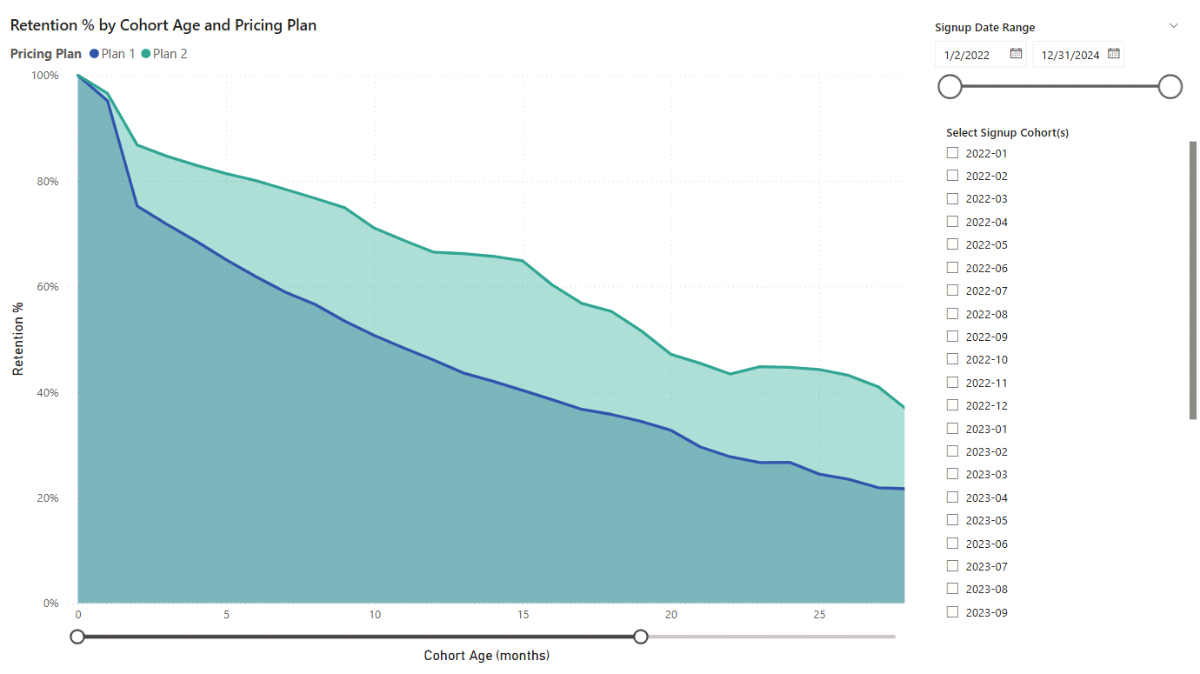
This retention curve complements the previous visuals. The monthly and annual analysis gave a broad view of customer signups, cancellations, and churn; the cohort heatmap revealed how retention evolves over time for different signup groups; and the retention curve shows how those trends break down across pricing plans and cohorts.
Together, these visuals form a complete picture of customer churn and retention.
Step 10. Setting Up Parameters for Customer Growth and Revenue Forecasting
With churn and retention analysis complete, the next step is to look forward and project how your customer base and revenue might evolve under different scenarios. Forecasting in Microsoft Power BI builds on the actuals we’ve analyzed so far, but introduces flexible parameters that let you test assumptions about growth, churn, and pricing.
By adjusting these parameters, you can see how changes in customer behavior or business strategy might affect your future growth trajectory.
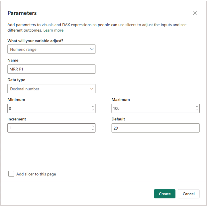
Step 10a. Creating a New Parameter in Microsoft Power BI
To set this up, go to the Modeling tab in Report view and click New parameter. Choose Numeric range to open the dialog box. For example, let’s start with Monthly Recurring Revenue (MRR) for customers on Plan 1. Name the parameter MRR P1, set the Data type to Decimal Number, use 0 as the Minimum, 100 as the Maximum, 1 as the increment, and 20 as the Default.
These numbers are illustrative; in your own analysis, you can adjust them as needed. Uncheck Add slicer to this page and click Create.
Step 10b. Key Parameters for Churn and Growth
Once created, the parameter will appear as a table with fields like MRR P1 and MRR P1 Value. You’ll reference these in measures to calculate revenue forecasts for Plan 1. Repeat the process to add other parameters:
- MRR P2 – Monthly Recurring Revenue for Plan 2 (default 35)
- Churn P1 Rate – Monthly churn for Plan 1 (default 0.06)
- Churn P2 Rate – Monthly churn for Plan 2 (default 0.03)
- Plan 1 Share – Share of new users choosing Plan 1 (default 70%)
- Start New – Starting number of new monthly signups (default 200)
- End New – Target number of new monthly signups at the end of growth (default 600)
- Growth Years – Number of years to grow from Start New to End New (default 3)
Since the Calendar table already extends five years beyond the last actual date, we have room to forecast customer growth and revenue across a meaningful period.
Step 10c. Defining Assumption and Helper Measures
Next, define three measures that tie the parameters to customer assumptions:
Assumption – Churn Rate: Applies the churn rate based on the customer’s plan.
Assumption - Churn Rate =
VAR p = SELECTEDVALUE('customer_lookup'[Signup Plan])
RETURN
SWITCH ( TRUE(),
    p = "Plan 1", [Churn P1 Rate Value],
    p = "Plan 2", [Churn P2 Rate Value],
    BLANK()
)
Assumption – MRR: Assigns the assumed monthly revenue per plan.
Assumption - MRR =
VAR p = SELECTEDVALUE('customer_lookup'[Signup Plan])
RETURN
SWITCH ( TRUE(),
    p = "Plan 1", [MRR P1 Value],
    p = "Plan 2", [MRR P2 Value],
    BLANK()
)
Assumption – New Share: Splits new signups between Plan 1 and Plan 2.
Assumption - New Share =
VAR p = SELECTEDVALUE('customer_lookup'[Signup Plan])
RETURN
SWITCH ( TRUE(),
    p = "Plan 1", [Plan1 Share Value],
    p = "Plan 2", 1 - [Plan1 Share Value],
    BLANK()
)
To complete the setup, add two helper measures that will simplify later calculations:
Parameter – Growth Months: Converts growth years into months.
Parameter - Growth Months = 12 * [Growth Years Value]Parameter – Plan2 Share: Ensures Plan 2 share is always the complement of Plan 1.
Parameter - Plan2 Share = 1 - [Plan1 Share Value]Finally, move all these measures into a Forecast display folder in the Model view to keep your workspace tidy. At this point, you’ve created the assumptions framework that will power your customer growth and revenue forecast in Microsoft Power BI.
Step 11. Modeling Future Customer Signups using Microsoft Power BI
With the assumption parameters in place, we can now forecast how many new customers will sign up each month. The idea is to start from the Start New parameter, gradually scale up to the End New parameter over the defined growth period, and then hold steady afterward.
To do this, create a new DAX measure called Forecast – New Customers:
Forecast - New Customers =
VAR monthsFromStart = DATEDIFF ( [Actual - Facts Max Date], MAX ( Calendar[Date] ), MONTH )
VAR growthMonths    = [Parameter - Growth Months]
VAR startNew        = [Start New Value]
VAR endNew          = [End New Value]
RETURN
IF (
  monthsFromStart <= 0,
  BLANK(),
  IF (
    monthsFromStart > growthMonths,
    endNew,
    startNew + DIVIDE ( monthsFromStart, growthMonths ) * ( endNew - startNew )
  )
)
This measure calculates the forecasted number of new customers for each future month. It works by checking how many months have passed since the last actual data point:
- If the date is in the past (
monthsFromStart <= 0), it returns BLANK(). - If we are beyond the growth period, it uses the End New parameter.
- Otherwise, it linearly interpolates between Start New and End New.
Next, create another measure to split these forecasted new customers by plan, using the Assumption – New Share logic defined earlier:
Forecast - New Customers by Plan =
[Forecast - New Customers] * [Assumption - New Share]
At this stage, your model can simulate new customer inflows based on adjustable growth assumptions. By tweaking the Start New, End New, and Growth Years parameters, you can immediately see how different customer acquisition scenarios affect future signups.
Step 12. Visualizing Customer Growth and Revenue Projections
With the forecast measures ready, we can now bring them to life through Power BI’s visuals. The goal is to create a dashboard that shows monthly signups, churn, active users, and revenue, while allowing you to interactively adjust the assumptions through slicers connected to your parameters.
Step 12a. Unifying Actuals and Forecasts
To combine actual data with forecasts, define hybrid DAX measures that switch between the two depending on whether the date falls in the actuals or forecast window:
Users - BOM =
IF ( SELECTEDVALUE('Calendar'[IsActual]),
     [Actual - BOM Active],
     [Forecast - BOM Active (Projected)] )

Users - New =
IF ( SELECTEDVALUE('Calendar'[IsActual]),
     [Actual - New Signups],
     [Forecast - New (Per Plan)] )

Users - Churned =
IF ( SELECTEDVALUE('Calendar'[IsActual]),
     [Actual - Churned Customers],
     [Forecast - Churned] )

Users - Active EOM =
IF ( SELECTEDVALUE('Calendar'[IsActual]),
     [Actual - Active Customers],
     [Forecast - Active (EOM)] )

Revenue - MRR =
VAR isForecast = SELECTEDVALUE ( 'Calendar'[IsForecast], FALSE() )
RETURN IF ( isForecast, [Assumption - MRR] * [Users - Active EOM] )
These DAX measures let you seamlessly switch between past performance and future projections, ensuring continuity in your visuals.
Step 12b. Building the Forecast Dashboard
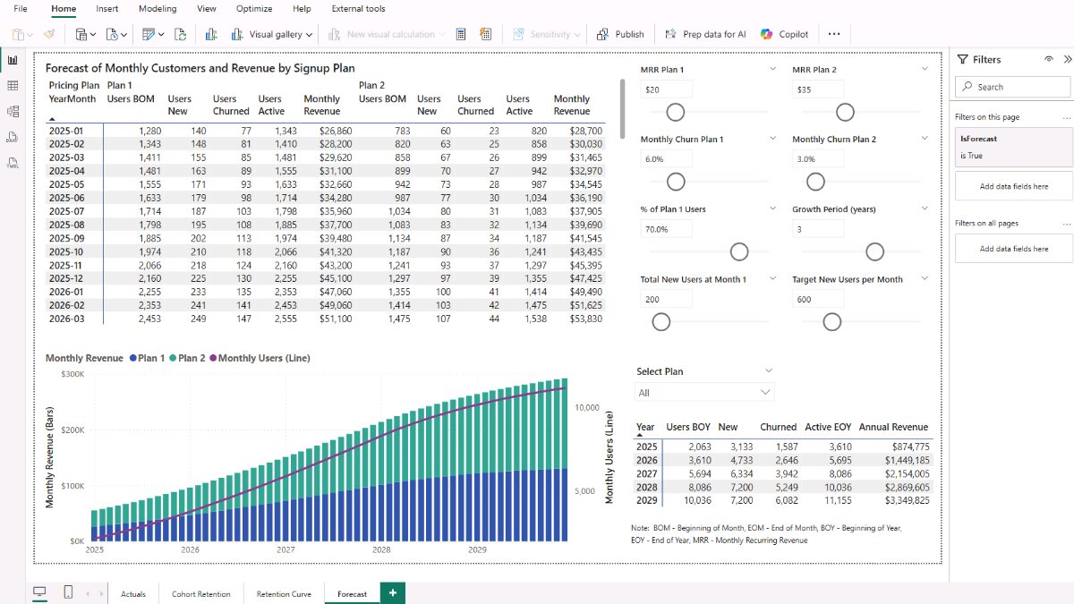
Create a new page and add a Matrix visual. Place Calendar[YearMonth] in Rows, pricing_plan_lookup[pricing_plan] in Columns, and add Users - BOM, Users - New, Users - Churned, Users - Active EOM, and Revenue - MRR in Values. In the Filters pane, drag Calendar[IsForecast] and set it to True so the view focuses only on forecast data.
Next, add slicers for each parameter (MRR values, churn rates, plan share, growth period, start/end signups). Format them as sliders or dropdowns, and adjust their titles for clarity (e.g., “Churn Rate – Plan 1”).
These controls let you instantly see the effect of changing assumptions on customer growth and revenue.
Step 12c. Adding Forecast Charts
Next, insert a Line and Stacked Column chart. Use Calendar[StartOfMonth] on the X-axis, pricing_plan_lookup[pricing_plan] in the column legend, Revenue - MRR - Total as the column value, and Users - Active EOM - Total as the line value. This combined chart shows how revenue is split across plans while tracking the overall customer base over time.
Revenue - MRR - Total =
SUMX (
    VALUES ( 'customer_lookup'[Signup Plan] ),
    CALCULATE ( [Revenue - MRR] )
)

Users - Active EOM - Total =
SUMX (
    VALUES ( 'customer_lookup'[Signup Plan] ),
    CALCULATE ( [Users - Active EOM] )
)
Step 12d. Summarizing Annual Forecasts
Add a matrix to summarize customer growth and revenue by year. Define measures for BOM users, EOM users, churned users, new users, and revenue at the annual level.
Annual – Active Users (Dec): Returns total active users at the end of December for the selected year.
Annual - Active Users (Dec) =
VAR y        = SELECTEDVALUE ( 'Calendar'[Year] )
VAR decStart = DATE ( y, 12, 1 )
RETURN
IF (
    NOT ISBLANK ( y ),
    SUMX (
        VALUES ( 'customer_lookup'[Signup Plan] ),
        CALCULATE (
            [Users - Active EOM],
            REMOVEFILTERS ( 'Calendar' ),
            'Calendar'[StartOfMonth] = decStart
        )
    )
)
Annual - BOM Users (Jan) =
VAR y = SELECTEDVALUE ( 'Calendar'[Year] )
VAR janStart = DATE ( y, 1, 1 )
RETURN
IF (
NOT ISBLANK ( y ),
SUMX (
VALUES ( 'customer_lookup'[Signup Plan] ),
CALCULATE (
[Users - BOM],
REMOVEFILTERS ( 'Calendar' ),
'Calendar'[StartOfMonth] = janStart
)
)
)Annual - Churned Users =
VAR y = SELECTEDVALUE ( 'Calendar'[Year] )
VAR monthsInYear =
CALCULATETABLE (
VALUES ( 'Calendar'[StartOfMonth] ),
REMOVEFILTERS ( 'Calendar' ),
DATESBETWEEN ( 'Calendar'[StartOfMonth], DATE ( y, 1, 1 ), DATE ( y, 12, 31 ) )
)
RETURN
IF (
NOT ISBLANK ( y ),
SUMX (
VALUES ( 'customer_lookup'[Signup Plan] ),
CALCULATE (
SUMX (
monthsInYear,
VAR m = 'Calendar'[StartOfMonth]
RETURN CALCULATE ( [Users - Churned], 'Calendar'[StartOfMonth] = m )
)
)
)
)Annual - New Users =
VAR y = SELECTEDVALUE ( 'Calendar'[Year] )
VAR monthsInYear =
CALCULATETABLE (
VALUES ( 'Calendar'[StartOfMonth] ),
REMOVEFILTERS ( 'Calendar' ),
DATESBETWEEN ( 'Calendar'[StartOfMonth], DATE ( y, 1, 1 ), DATE ( y, 12, 31 ) )
)
RETURN
IF (
NOT ISBLANK ( y ),
SUMX (
VALUES ( 'customer_lookup'[Signup Plan] ),
CALCULATE (
SUMX (
monthsInYear,
VAR m = 'Calendar'[StartOfMonth]
RETURN CALCULATE ( [Users - New], 'Calendar'[StartOfMonth] = m )
)
)
)
)Annual - Revenue (MRR) =
VAR y = SELECTEDVALUE ( 'Calendar'[Year] )
VAR monthsInYear =
CALCULATETABLE (
VALUES ( 'Calendar'[StartOfMonth] ),
REMOVEFILTERS ( 'Calendar' ),
DATESBETWEEN ( 'Calendar'[StartOfMonth], DATE ( y, 1, 1 ), DATE ( y, 12, 31 ) )
)
RETURN
IF (
NOT ISBLANK ( y ),
SUMX (
VALUES ( 'customer_lookup'[Signup Plan] ),
CALCULATE (
SUMX (
monthsInYear,
VAR m = 'Calendar'[StartOfMonth]
RETURN CALCULATE ( [Revenue - MRR], 'Calendar'[StartOfMonth] = m )
)
)
)
)
At this point, you have a fully interactive churn and forecast model in Microsoft Power BI. You can adjust churn rates, pricing, or growth parameters and instantly see how customer retention patterns translate into future revenue. This closes the loop: starting from raw signups and cancellations, through churn and retention analysis, all the way to actionable revenue forecasting.
📌 Recap: Building a Power BI’s Customer Churn and Revenue Forecast Model
Here’s a quick recap of the steps to build a complete Customer Churn and Forecasting Dashboard in Microsoft Power BI:
-
- Prepare Your Data Sources. Import signup, cancellation, and customer lookup data to create the foundation of your model.
- Build a Calendar Table. Add a dedicated date table to manage time-based analysis such as monthly and annual churn.
- Define Relationships Between Tables. Connect lookup, transaction, and calendar tables with primary/foreign key relationships.
- Create Calculated Columns. Add fields like signup cohorts, cohort labels, and signup plans to segment users effectively.
- Build Core Measures. Define measures for new signups, churned customers, active users, churn rate, and BOM balances.
- Analyze Customers Monthly and Annually. Use Power BI visuals (matrices, slicers, and charts) to track signups, churn, and active customers.
- Add Cohort Retention Measures. Calculate cohort sizes, cancels to date, active users at different ages, and retention percentages.
- Visualize Cohort Retention with a Heatmap. Display retention evolution by cohort and customer age using conditional formatting.
- Explore Retention Curves. Compare retention trends across cohorts and pricing plans with an area chart.
- Set Up Parameters for Forecasting. Create Power BI parameters to model revenue, churn rates, plan shares, and customer growth scenarios.
- Create Forecast Measures. Build measures for projected new signups, churn, BOM balances, and EOM active customers.
- Visualize Monthly and Annual Forecasts. Combine actuals with projections, analyze results with matrices and charts, and apply parameter-driven scenarios.
By following these steps, you’ve built a robust and flexible churn and forecasting model in Microsoft Power BI that helps you analyze historical customer behavior, project future growth, and test different business scenarios.
🔍 Preview the Interactive Power BI Dashboard
Explore the finished customer churn & forecasting dashboard below—the same model built in this tutorial. Use the slicers and hover tooltips to drill into cohorts, plans, and time periods.
📥 Download My Customer Churn Forecast Dashboard Template
To help you put the tutorial into practice quickly, I’ve prepared a ready-to-use package that includes everything you need:
- Power BI (.pbix) file with the full churn and forecasting model, including the data model setup, relationships, calculated columns, all DAX measures, and pre-built dashboards for churn analysis, retention heatmaps, retention curves, and interactive forecasts.
- CSV data sources (signups, cancellations, customer lookup, pricing plans) so you can instantly load and explore the model.
- Text file with all DAX measures neatly organized for reference and reuse.
This package lets you analyze churn and retention, compare customer cohorts, experiment with different forecast assumptions, and project customer growth and recurring revenue using Microsoft Power BI.
Secure Checkout | Instant Download | 30-Day Money-Back Guarantee
Secure Checkout | Instant Download | 30-Day Money-Back Guarantee
Get in Touch
 Hi, I’m Jacek. I’m passionate about Microsoft Power BI, DAX, and customer analytics! I hope this tutorial gave you a strong foundation for building your churn, retention, and revenue forecasting model in Microsoft Power BI.
Feel free to get in touch if you have any questions about churn analysis, forecasting, or data transformation techniques.
You can also explore my other tutorials for more hands-on guides or check out my One-to-One Training and Data Analytics Support if you need personalized support.
Disclaimer: This tutorial is for informational and educational purposes only and should not be considered professional advice.
Explore More Tutorials
- Subscription Model with Churn Calculation in Microsoft Excel — build a subscription model, calculate churn and retention, and project revenue impacts.
- Power BI Marketing Performance & Forecast Dashboard — Create a Power BI dashboard to track campaign performance, model customer growth, and forecast marketing ROI with DAX-driven metrics.
- Power BI Yield Management & Inventory Analysis — Step-by-step tutorial covering inventory performance, yield metrics, forecasting parameters, and variance analysis.
- Excel Churn, Retention & Cohort Analysis — Measure churn, build retention cohorts, and visualize lifecycle trends in Excel.
- Python + Excel: Data Consolidation & Transformation — Consolidate multi-file data and automate transformations with Python and Excel.