Last Updated on January 3, 2026
This step-by-step tutorial will show you how to analyse data and Excel spreadsheets using Power Query and Pivot Tables. It will use an example of a data set to examine the popularity and length of songs by their release year. The analysis will use Spotify data, which you can access and download from the Kaggle website here.
Table of Contents
Step 1: Use Power Query Editor to Inspect Data
Before you can analyse your data in Microsoft Excel, make sure to inspect it first. This will allow you to understand the data set’s structure and each record’s usefulness. You can then select and limit the data that you need to load into your spreadsheet.
Load the data into Power Query first to inspect and transform your CSV or Excel file. To import a CSV file:
- Create a new Excel workbook and click on the Data tab.
- Click the Get Data icon, then select From File and finally, From Text/CSV.
- Choose the file you want to import. You will see a window with a preview of the data.
- Click on the Transform Data button to load the data into the Power Query editor.

We can divide our data set into two parts: categorical and quantitative. In our example, the categorical data will consist of id, artist or track name. Similarly, the quantitative data will consist of numerical values such as tempo, volume or duration.
Step 2: Handling Large Excel Files in Power Query
Analysing big data sets in Microsoft Excel can be overwhelming, so we want to limit the size of the imported data. Our goal is to examine tracks released on or after the year 1960 and to analyse their popularity and duration. Consequently, we can cut our spreadsheet’s size by only keeping the records we are interested in.
First, let’s limit the number of columns. After loading the data into the Power Query editor, go to the Home tab and click on Choose Columns. We want to analyse duration, popularity, and tempo metrics, so tick those columns. Also, keep the data that will allow you to identify and describe tracks, so select id, name, year, and artists.

Since our analysis will focus only on data released after 1960, I will exclude any records released before that year. To filter the row selections, click on the filter arrow next to the header name. Then, select Number Filters and click on Greater Than or Equal To…. Finally, type the value 1960 in the Filter Rows and click OK.
To load the data, click on the Close & Load icon at the upper left corner of the Power Query editor. Your spreadsheet will now populate the data with a table containing limited rows and columns. Head to the Data tab to explore how to filter, group and sort your Excel data table.
Step 3: Transforming and Converting Data with Power Query
Instead of using Excel formulas to calculate new values, you can add a custom column in Power Query. We aim to use the existing data and convert it into new records. Calculating new data in Power Query will make the analysis faster and our spreadsheet more robust.
To add a new column in your existing Power Query, go to the Query tab and click on the Edit button. This will take you back to the Power Query editor. Then, click on the Custom Column, which you will find in the Add Column tab.
We aim to convert the ‘Duration_ms’ column from milliseconds to minutes. Go to the Available Columns area, where you will see a list of all available column names. Then, double-click on the ‘duration_ms’ field to add it to the Custom column formula box and type in ‘/ 60000’. Lastly, type ‘Duration_mins’ in the New column name box and click OK.

Before moving on, we want to create one more custom column with unique descriptive data for each track:
- Click on the Add Column icon again and double-click on the ‘artists’ field.
- Type in ‘&” “&’ and double click on the ‘name’ field. This will combine text from the two columns and separate them by a space.
- Type ‘artists+track’ in the New column name box to label the new record and click OK.
Go back to the Home tab and click on the Close & Load icon. You should see an Excel table refreshed with the new data.
Step 4: Set Up a Pivot Table in Microsoft Excel
Pivot tables allow you to quickly analyse your spreadsheets, aggregate values and group them into categories.
To create a new Pivot Table:
- Go to your spreadsheet and select all data in the table.
- Click on the Pivot Table icon in the Insert tab.
- Select the New Worksheet option in the Create PivotTable window and then click OK.
You will now see a spreadsheet with an empty pivot table to the left and PivotTable Fields to the right.
Using our data example, we want to examine the track names by their release date. Drag the year from the PivotTable fields to the Rows area to display year values. You will find the Rows area at the lower-right corner, below the list of the available fields. Then, drag the ‘artists+name’ and place it below the ‘year’ field.
To change the Pivot Table’s layout, click on the Design tab at the top of the Excel workbook and click on the Report Layout. Then, select the Show in Tabular Form option to change the Pivot Table’s layout.
Your pivot table should now display rows containing year values and corresponding artists’ and tracks’ names to their right. Adjust the width of the columns to fit the Pivot Table onto the screen.

Tip: To preserve the column width setup, right-click on the PivotTable, select Pivot Table Options… and then untick the Autofit column widths on the update checkbox.
Step 5: Analysing Excel Data with Pivot Tables
To complete the data analysis, go to the PivotTable Fields area and drag the data into the Values area below. Our task is to examine the popularity of each track, so we will use the Popularity field as the measure. Hence, drag the field into the Values area. Notice the ‘Sum of Popularity’ column added in the Pivot Table. You may need to adjust the column widths to fit the table onto the screen.
We want to display the numbers as averages, so let’s change the value settings. Return to the Values area and click on the Sum of Popularity field. Then, choose Value Field Settings… and you will see a Summarize Values By window. Finally, select Average from the list of options and click OK.
Our goal is only to analyse the most popular tracks for every release year. To limit the number, click on the filter arrow next to the ‘artists+track’ header. Then, select Value Filters and click on the Top 10… In the Top 10 Filter window, change the value from ’10’ to ‘1’.

Finally, go to the Design tab, click the Subtotals icon and select Do Not Show Subtotals. Then, click the Grand Totals icon and select Off for Rows and Columns. You will now see a list of only the most popular tracks grouped by their release year.
Step 6: Aggregating Data in Pivot Table
One advantage of using a Pivot Table to analyse Excel data is the ease of grouping values. As an example, we will group our year values into ten-year intervals. We will then examine the most popular songs by the decade in which they were released.
To aggregate the data, right-click on one of the values in the ‘Year’ column and select the Group… option. Then, in the Grouping window, type in ‘1960’ as your starting value and ‘2020’ as the end. To aggregate the year values into ten-year intervals, type ’10’ in the by field. Lastly, click OK, and you will see the track data collapsed into ten-year buckets, for instance, ‘1960-69’.

Let’s expand our analysis to include the five most popular songs from every decade:
- Click on the filter arrow next to the ‘artist+track’ header and select Top 10… from the Value Filters menu.
- Change the value from 1 to 5 in the Top Filter window and click OK.
- Sort the values in descending order to show the most popular tracks at the top of each period.
Step 7: Analyse the Results and Cleanse Data
Our initial data analysis suggests that the most popular songs are tracks related to winter tunes. That doesn’t seem right. After looking at the source data description, we realised the popularity measure was calculated in December. As a result, the overall number of downloads and the calculation of popularity were skewed towards holiday tunes. To rectify that, we want to exclude the data from our analysis.
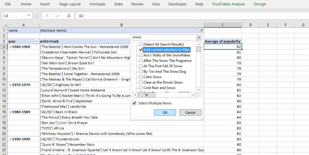
We don’t want to remove any data from the Excel table, so instead, let’s use the Pivot Table’s functionalities. To clean and filter out data, drag the ‘name’ field into the Filters area. Then, click the arrow next to the ‘All’ value in cell B1. You will see the list of unique values from the name column.
Tick the Select Multiple items checkbox and click on the Search field at the top of the box. Type in ‘snow’ and then untick the (Select All Search Results) checkbox. As a result, you will now see the names of all tracks containing ‘snow’ in their titles. Untick the Add current selection to filter checkbox and then click OK. Finally, repeat the same step for other search terms such as ‘Christmas’, and ‘sleigh’ until your name list looks clean.
Step 8: Using a Pivot Chart to Visualise Data
Pivot Table helps analyse Excel data and allows you to visualise it. So, let’s expand our data analysis and examine how the average duration of songs evolved over the decades. To save time, we will use the Pivot Table created in the previous steps as a template.
First, remove some of the values and fields from the Pivot Table. Drag and remove the ‘artists+track’ field from the rows area. Then, remove the Average of Popularity field in the Values area. Consequently, the Pivot Table should now be showing a list of decades only.
To display average duration values, drag the ‘duration_mins’ field into the Values area. The ‘duration_mins’ was the Power Query’s custom column we created earlier. Then, click on the field name and choose Value Field Settings. Finally, select Average from the list of options in the Summarize value field by window.
To insert a chart, go to the PivotChart Design tab and click the PivotChart icon. I have chosen the horizontal bar chart to visualise and quickly compare the data over time. Right-click on the chart to change the layout, style or add new elements. Lastly, untick the gridlines checkbox in the View tab to remove any background distractions.

Summary: Using Power Query and Pivot Tables to Analyse Data
This tutorial has shown how to analyse data in Microsoft Excel. We used the Power Query to handle a large data file and applied filters to limit the number of imported rows and columns. We also created new custom columns to transform the existing data.
With the data loaded into an Excel table, we used a Pivot table to analyse it. By aggregating and filtering the data, we could examine songs’ popularity by the year or the decade of their release.
To visualise the data, we used a pivot table graph. Using a horizontal bar chart helped us to analyse the data over time. Lastly, we learned how to use a filter to adjust the results without removing any source data.
To practice analysing data, you can download the original data source from this Kaggle’s page.
Get in Touch
 Hi, my name is Jacek and I love spreadsheets! I hope you’ve enjoyed reading this tutorial as much as I did writing it! If you have any questions about Microsoft Excel and data analysis, don’t hesitate to get in touch.
Explore my other tutorials to learn more about data or financial analysis. If you need further support, find out about my One-to-One Training and Data Analytics Services.
Learn More
Analyze and Forecast Customer Churn and Revenue – Build a churn/retention model in Microsoft Power BI using DAX, cohort analysis, and interactive forecasts.
Power BI Consolidated P&L & Forecast Tutorial — learn how to merge data from multiple entities, apply FX conversions, and create a complete forecasting model in Microsoft Power BI.
Your First Steps in Microsoft Excel – Beginner’s Crash Tutorial – This post will take you through the basic functionalities and refresh your knowledge of spreadsheets.
How to Use Python and Pandas for Data Consolidation and Transformation – This introductory tutorial will introduce you to Python and show you how to write scripts to analyse and manipulate your CSV or Excel data files.
How to Visualise Data in Tableau – If you want to learn more about data visualisation tools, this tutorial will take you through the basics of Tableau and show you how to transform a simple CSV file into an interactive dashboard.
How to Use Cohort Analysis to Calculate Retention and Churn Rate in Microsoft Excel – This step-by-step tutorial will guide you through an example of applying data analysis skills in practice.
Learn How to Become a Self-Taught Data Analyst – Here, you will find a few practical tips and links to resources, which I found useful while learning to become a data analyst.