Last Updated on February 21, 2026
In this Power BI tutorial, we will build a consolidated Profit & Loss (P&L) across multiple subsidiaries. We’ll start by importing four Fact files and appending them into a single dataset. Next, we’ll standardize the chart of accounts by mapping local account codes into common categories and subcategories (Revenue, COGS, OPEX).
Because each subsidiary reports in a different currency, we’ll convert all amounts into a single reporting currency using FX assumptions. With that foundation, we’ll create a monthly P&L that includes Gross Profit and Operating Profit, plus month-over-month variances.
We’ll then expand the analysis to profitability by subsidiary and client (top revenue contributors and least profitable clients), build an interactive dashboard, and finish with a 12-month forecast driven by parameters for YoY changes in Revenue, COGS, OPEX, and currency movement.
🔎 You can preview the dashboard at the end of this tutorial to follow along.
Table of Contents
Step 1. Load and Append Data in Microsoft Power BI
In this tutorial we will work with four Fact files containing accounting data from each subsidiary, as well as two supporting tables that will link everything together.
For this Consolidated P&L and Forecast Dashboard, I used the following source files:
- Fact_US, Fact_UK, Fact_JP, Fact_DE — transactions data with date, local account code/name, client, amount, and currency
- FxRates — a dataset with exchange rates against the reporting currency (USD)
- MapAccounts — a mapping table that links local account codes to a standardized code, subcategory, and category (Revenue, COGS, OPEX)
To load the Fact files, go to Power BI’s Home tab, click Get Data, and select Text/CSV. Repeat this process for all four Fact files. Once loaded, click on Transform Data to open the Power Query Editor. On the left, you should see the four queries with the Fact labels. Clicking on any of them will let you inspect the data, check column types, and review sample values.
📥 You can download the source files and the completed Power BI dashboard file at the end of this tutorial.
Now, we want to combine these data sources into a single dataset. In Power Query, click on the arrow next to Append Queries, then choose Append Queries as New. In the dialog box, select the “Three or more tables” option and add the four Fact queries into the Tables to append box.
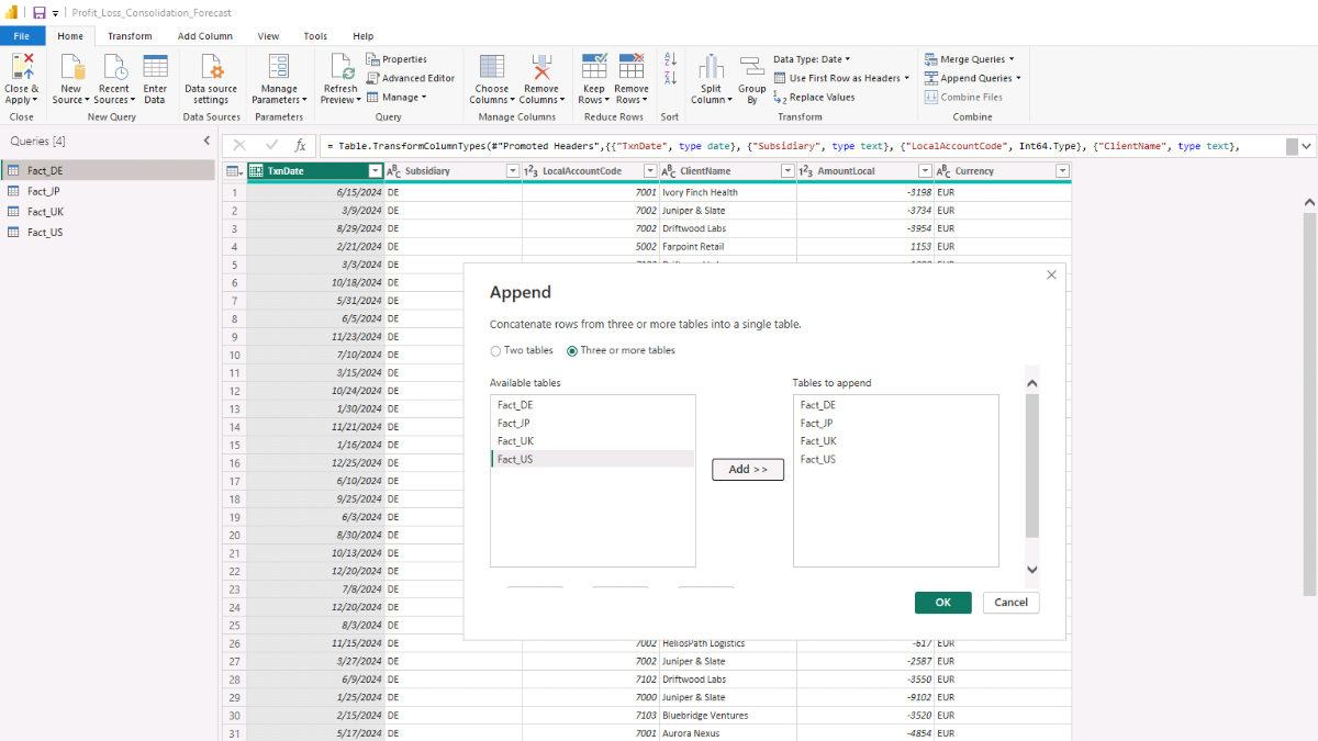
Click OK and you should see a new table appear on the left, most likely called Append1. Select it and rename it to Data_Consolidated in the Properties pane on the right.
Note: For convenience, this tutorial uses CSV files as the source data, but in a real-world setup you could just as easily connect to a SQL database or another source through Microsoft Power BI’s Get Data connectors.
Step 2. Add Mapping Tables and Create Relationships in the Data Model
With the consolidated Fact table in place, it’s time to bring in the lookup tables and connect everything. Load FxRates and MapAccounts, then switch to Model view (left sidebar). You should now see the four original Fact queries, plus FxRates and MapAccounts alongside your consolidated table.
Next, add a Calendar table. This will let you aggregate results by any time grain and filter visuals consistently across the report.
DAX — Calendar table (auto-detects min/max year from the data and adds one forecast year)
Calendar =
VAR MinYear =
    YEAR ( MINX ( ALL ( Data_Consolidated[TxnDate] ), Data_Consolidated[TxnDate] ) )
VAR MaxYearActual =
    YEAR ( MAXX ( ALL ( Data_Consolidated[TxnDate] ), Data_Consolidated[TxnDate] ) )
VAR StartDate = DATE ( MinYear, 1, 1 )
VAR EndDate   = DATE ( MaxYearActual + 1, 12, 31 )  // +1 accommodates one full forecast year
RETURN
ADDCOLUMNS (
    CALENDAR ( StartDate, EndDate ),
    "Year", YEAR ( [Date] ),
    "Month Number", MONTH ( [Date] ),
    "Month Name", FORMAT ( [Date], "MMMM" ),
    "Year-Month", FORMAT ( [Date], "YYYY-MM" ),
    "YearMonth Sort", YEAR ( [Date] ) * 100 + MONTH ( [Date] ),
    "Quarter", "Q" & FORMAT ( [Date], "Q" ),
    "Week Number", WEEKNUM ( [Date], 2 ),
    "Day", DAY ( [Date] ),
    "Day Name", FORMAT ( [Date], "dddd" ),
    "IsForecast", YEAR ( [Date] ) = MaxYearActual + 1,
    "IsActual", YEAR ( [Date] ) <= MaxYearActual
)
A new table named Calendar will appear. Right-click it, choose Mark as date table, and then select the Date column in the dialog. This ensures time intelligence functions work correctly.
Step 2b. Create a join key for account mapping
Before we build relationships, add a custom key that links the consolidated transactions to MapAccounts.
Open Transform Data to return to Power Query. Select the Data_Consolidated query, then go to Add Column → Custom Column. Name the column LocalKey and use:
=[Subsidiary] & "-" & Text.From([LocalAccountCode])
Click OK and you’ll see a new LocalKey that combines the subsidiary and local account code. Repeat the same step for the MapAccounts query so both tables share the same join key.
Close Power Query with Close & Apply, then head back to Model view to define the relationships.
Step 2c. Build the data model
Set the relationships to 1-to-many flowing from the lookup/mapping tables into Data_Consolidated. Drag the columns in Model view as follows:
- MapAccounts[LocalKey] → Data_Consolidated[LocalKey]
- FxRates[Currency] → Data_Consolidated[Currency]
- Calendar[Date] → Data_Consolidated[TxnDate]
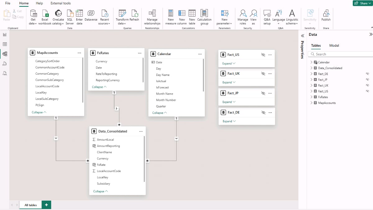
Because the four original Fact queries are now appended into Data_Consolidated, it’s easy to hide them from the report layer to avoid confusion. Right-click each original Fact query and choose Hide in report view.
Tip: For hands-on practice with modeling, go to File → Options and settings → Options → Current File → Data Load and uncheck Autodetect new relationships after data is loaded. This helps you control relationship directions and cardinality explicitly.
Step 3. Build the Consolidated Monthly Profit & Loss
We’ll start the reporting layer with a simple monthly P&L matrix showing Revenue, COGS, and OPEX. Before that, convert all local currency amounts into a single reporting currency (USD).
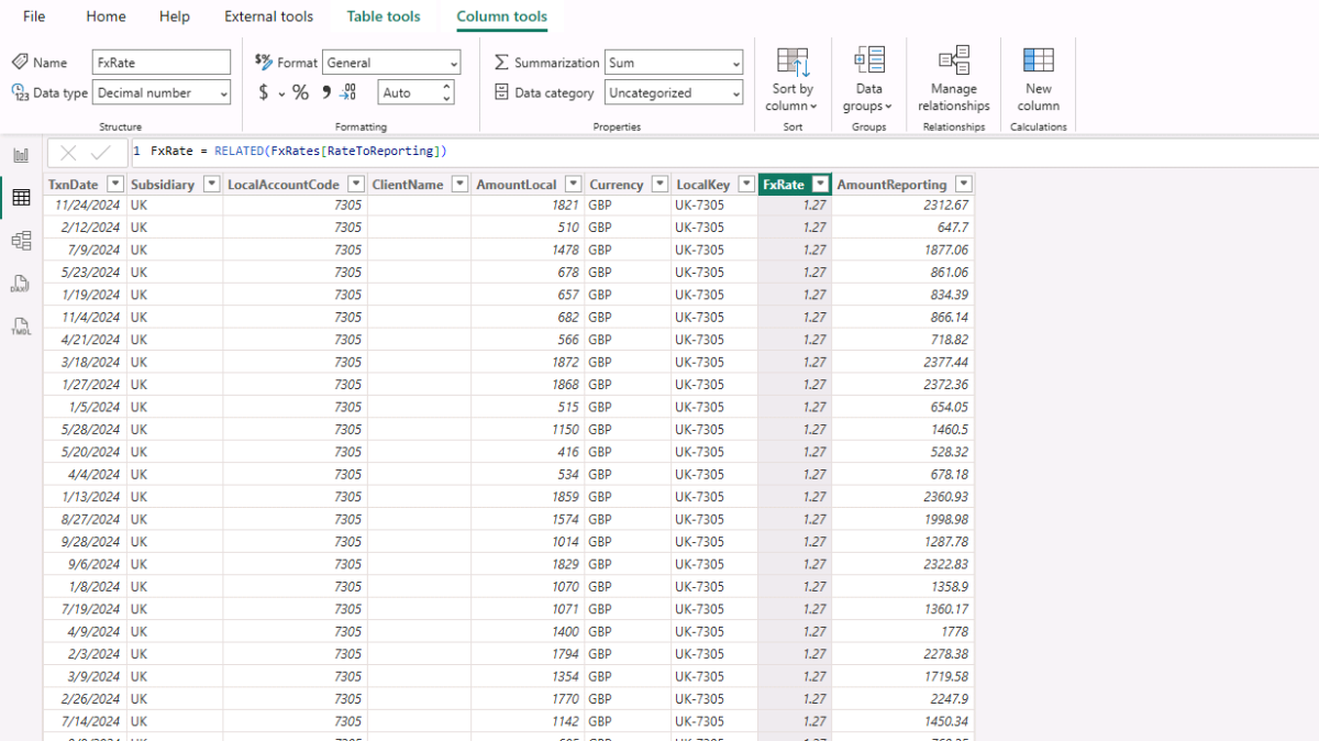
Open Table view, select Data_Consolidated, and choose Table tools → New column to add two calculated columns.
DAX — Bring in the FX rate from the FxRates table (via relationship)
FxRate =
RELATED ( FxRates[RateToReporting] )
DAX — Convert local amount into reporting currency
AmountReporting =
Data_Consolidated[AmountLocal] * Data_Consolidated[FxRate]
With the conversion in place, create a Measures table to keep things tidy: in Report view, click Enter data, name it Measures_Table, and Load. Then right-click Measures_Table → New measure to add the following measures.
Total reporting amount (un-signed)
Amount (Reporting) =
SUM ( Data_Consolidated[AmountReporting] )
Signed amount using the account sign from MapAccounts
Amount (Reporting, Signed) =
SUMX (
    Data_Consolidated,
    Data_Consolidated[AmountReporting] * RELATED ( MapAccounts[PLSign] )
)
Actuals only (exclude forecast year)
Actual Amount =
CALCULATE ( [Amount (Reporting, Signed)], Calendar[IsActual] = TRUE )
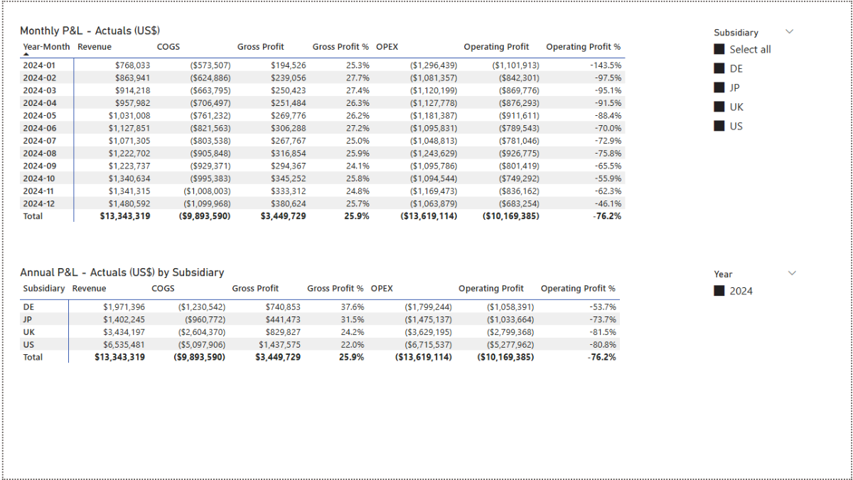
Now insert a Matrix visual (Report view → Insert → Matrix). Put Calendar[Year-Month] on Rows, MapAccounts[CommonCategory] on Columns, and [Actual Amount] on Values to get the monthly P&L.
Step 4. Profitability DAX Measures and Analysis
Now let’s expand the report with Gross Profit, Operating Profit, and their margins. We’ll build on the signed amount you created in Step 3. Add the following DAX measures to your Power BI report.
Revenue (actuals only)
Revenue (Actual) =
CALCULATE (
    [Amount (Reporting, Signed)],
    Calendar[IsActual] = TRUE,
    MapAccounts[CommonCategory] = "Revenue"
)
COGS (actuals only)
COGS (Actual) =
CALCULATE (
    [Amount (Reporting, Signed)],
    Calendar[IsActual] = TRUE,
    MapAccounts[CommonCategory] = "COGS"
)
OPEX (actuals only)
OPEX (Actual) =
CALCULATE (
    [Amount (Reporting, Signed)],
    Calendar[IsActual] = TRUE,
    MapAccounts[CommonCategory] = "OPEX"
)
Gross Profit and Operating Profit
Gross Profit (Actual) =
[Revenue (Actual)] + [COGS (Actual)]   // COGS carries a negative sign

Operating Profit (Actual) =
[Gross Profit (Actual)] + [OPEX (Actual)]   // OPEX carries a negative sign
Profitability margins
Gross Profit Margin (Actual) % =
DIVIDE ( [Gross Profit (Actual)], [Revenue (Actual)] )

Operating Profit Margin (Actual) % =
DIVIDE ( [Operating Profit (Actual)], [Revenue (Actual)] )
Add these measures to a Matrix with Calendar[Year-Month] on Rows. Place Revenue (Actual), COGS (Actual), OPEX (Actual), Gross Profit (Actual), Operating Profit (Actual), and both margin measures in Values. For cleaner labels, use Rename for this visual.
Step 4b. Enable subsidiary slicing
To let readers filter and break down results by subsidiary (aligned with our model logic), create a small helper DAX table of unique subsidiaries.
DAX — Subsidiary list (from the fact table)
Subsidiary =
VALUES ( Data_Consolidated[Subsidiary] )
Create a one-to-many relationship from Subsidiary[Subsidiary] to Data_Consolidated[Subsidiary] in Model view.
Back in Report view, insert a Slicer and add Subsidiary[Subsidiary] as the field. Choose Vertical list for the slicer style. The monthly P&L now responds to the selected subsidiary.
For an annual P&L by subsidiary, duplicate the matrix (or insert a new one) with Subsidiary on rows and your revenue/cost/profit measures as values. Add a Year slicer from the Calendar table to control the period.
Finally, with the Subsidiary slicer selected, go to Format → Edit interactions. On the annual matrix visual, choose None so it always shows the subsidiary breakdown regardless of the slicer selection elsewhere.
Step 5. Variance Analysis and Profitability by Client
Create a new report page (e.g., Analysis) and duplicate the monthly P&L matrix from Step 4. We’ll extend it with month-on-month (MoM) comparisons so readers can see how Revenue, COGS, OPEX, and profits move each month. Add the following DAX measures first.
Previous-month baselines (Actuals only)
Prev COGS (Actual) =
CALCULATE ( [COGS (Actual)], DATEADD ( Calendar[Date], -1, MONTH ) )

Prev Gross Profit (Actual) =
CALCULATE ( [Gross Profit (Actual)], DATEADD ( Calendar[Date], -1, MONTH ) )

Prev Month Actual (Actual) =
CALCULATE ( [Actual Amount], DATEADD ( Calendar[Date], -1, MONTH ) )

Prev Operating Profit (Actual) =
CALCULATE ( [Operating Profit (Actual)], DATEADD ( Calendar[Date], -1, MONTH ) )

Prev OPEX (Actual) =
CALCULATE ( [OPEX (Actual)], DATEADD ( Calendar[Date], -1, MONTH ) )

Prev Revenue (Actual) =
CALCULATE ( [Revenue (Actual)], DATEADD ( Calendar[Date], -1, MONTH ) )
What they do: Shift the current context one month back using Power BI’s DATEADD function [external link] to fetch last month’s values for each KPI.
Revenue MoM (absolute and %)
Revenue MoM Δ (Actual) =
[Revenue (Actual)] - [Prev Revenue (Actual)]

Revenue MoM % (Actual) =
DIVIDE ( [Revenue MoM Δ (Actual)], [Prev Revenue (Actual)] )
COGS MoM (absolute and %)
COGS MoM Δ (Actual) =
[COGS (Actual)] - [Prev COGS (Actual)]

COGS MoM % (Actual) =
DIVIDE ( [COGS MoM Δ (Actual)], [Prev COGS (Actual)] )
Gross Profit MoM (absolute and %)
Gross Profit MoM Δ (Actual) =
[Gross Profit (Actual)] - [Prev Gross Profit (Actual)]

Gross Profit MoM % (Actual) =
VAR PrevVal = [Prev Gross Profit (Actual)]
VAR CurrVal = [Gross Profit (Actual)]
VAR Delta   = CurrVal - PrevVal
RETURN DIVIDE ( Delta, ABS ( PrevVal ) )
Why ABS? If last month’s GP was negative, dividing by its absolute value stabilizes the percentage directionality.
OPEX MoM (absolute and %)
OPEX MoM Δ (Actual) =
[OPEX (Actual)] - [Prev OPEX (Actual)]

OPEX MoM % (Actual) =
DIVIDE ( [OPEX MoM Δ (Actual)], [Prev OPEX (Actual)] )
Operating Profit MoM (absolute and %)
Operating Profit MoM Δ (Actual) =
[Operating Profit (Actual)] - [Prev Operating Profit (Actual)]

Operating Profit MoM % (Actual) =
VAR PrevVal = [Prev Operating Profit (Actual)]
VAR CurrVal = [Operating Profit (Actual)]
VAR Delta   = CurrVal - PrevVal
RETURN DIVIDE ( Delta, ABS ( PrevVal ) )
With these DAX measures in place, extend the monthly P&L matrix to include the MoM Δ and MoM % columns for Revenue, COGS, OPEX, Gross Profit, and Operating Profit.
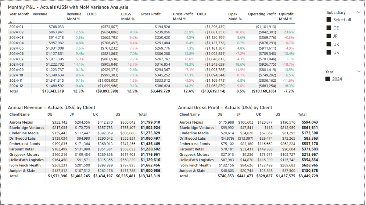
Format the new measures appropriately: currency for Δ measures and percentage for MoM % measures. For readability, apply conditional formatting in the Format pane of the Matrix. Under Cell elements, enable Conditional formatting (fx) for Font color, choose Rules, and set colors for values between Min and 0 (negative) and 0 and Max (positive).
Step 5b. Profitability by client
To analyze by client, create a small lookup table of distinct client names.
DAX — Clients list (from the fact table)
Clients =
VALUES ( Data_Consolidated[ClientName] )
What it does: Materializes a unique list of clients for filtering and row headers.
In Model view, create a one-to-many relationship from Clients[ClientName] to Data_Consolidated[ClientName].
Go to Report view, add a Matrix for Revenue by Client × Subsidiary: put Clients[ClientName] on Rows, Subsidiary[Subsidiary] on Columns, and [Actual Amount] on Values. Add MapAccounts[CommonCategory] and select Revenue only in the Filters pane.
For annual gross profit by client, duplicate the matrix and change the visual-level filter to Revenue + COGS (since COGS is negative, Revenue + COGS yields Gross Profit).
Finally, on the Subsidiary slicer, choose Format → Edit interactions, and set None on the two client matrices so they remain independent of that slicer’s selection.
Step 6. Create a Power BI Dashboard and Visualize the P&L
Let’s bring the consolidated numbers to life with a dashboard that highlights monthly trends and annual benchmarks.
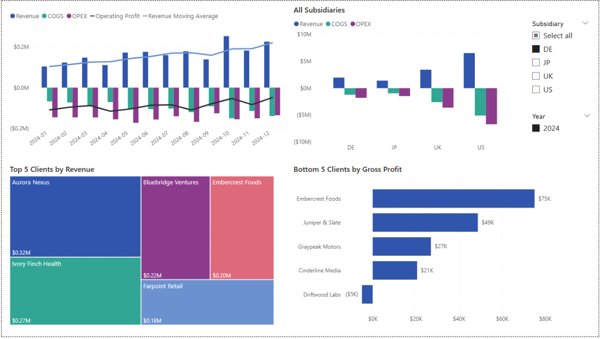
Create a new Dashboard page in Report view. Add a Line and clustered column chart. Put Calendar[Year-Month] on the X-axis. Use MapAccounts[CommonCategory] for the Columns (so bars show Revenue, COGS, OPEX) and add Operating Profit (Actual) to the Line y-axis. This mixes category totals (bars) with profitability (line) on the same monthly timeline.
To smooth volatility on the revenue line, add a 3-month moving average:
DAX — Revenue 3-month moving average (Actuals)
Revenue (Actual, 3M MA) :=
VAR LastVisibleDate =
    MAX ( Calendar[Date] )
VAR Window3M =
    DATESINPERIOD ( Calendar[Date], LastVisibleDate, -3, MONTH )
VAR Total3M =
    CALCULATE ( [Revenue (Actual)], Window3M )
VAR MonthCount =
    CALCULATE ( DISTINCTCOUNT ( Calendar[Year-Month] ), Window3M )
RETURN
DIVIDE ( Total3M, MonthCount )
What it does: Finds the last visible date in the current context, looks back three months using Power BI’s DATESINPERIOD funtion [external link], sums revenue over that window, and divides by the number of months to produce a rolling average you can add to the Line y-axis.
Format series as currency where appropriate and, for readability, rename legend/series labels (e.g., Revenue, COGS, Profit).
Next, add an “All Subsidiaries” Clustered column chart: set Subsidiary on the X-axis, MapAccounts[CommonCategory] as Legend, and [Actual Amount] as Y-axis. This gives a quick annual comparison of Revenue, COGS, and OPEX across countries.
Finish the page with slicers for Subsidiary and Year. Select the Subsidiary slicer, choose Format → Edit interactions, and set None on the All Subsidiaries chart to keep it as a stable benchmark.
Step 6b. Analyzing Clients by Revenue and Profitability
Finally, surface the top revenue contributors and least profitable clients. Insert a Treemap with Clients[ClientName] as Category and [Actual Amount] as Values. In the visual’s filters, add MapAccounts[CommonCategory] = Revenue. Add Clients[ClientName] again to Filters as Top N, drag [Revenue (Actual)] into By value, select Top, and set 5. Apply the filter to display Top 5 Clients by Revenue.
Duplicate this visual and switch it to a Clustered bar chart. Remove the CommonCategory filter (or include Revenue, COGS, OPEX), set Top N to use [Gross Profit (Actual)], change Show items to Bottom, and keep 5. This returns the five least-profitable clients for the selected region(s).
Step 7. Forecast — Power BI Parameters and DAX Measures
We’ll now build a 12-month forecast driven by parameters that capture assumptions for YoY changes in Revenue, COGS, OPEX, and USD FX. First, create the parameters; then tie them into forecast DAX measures.
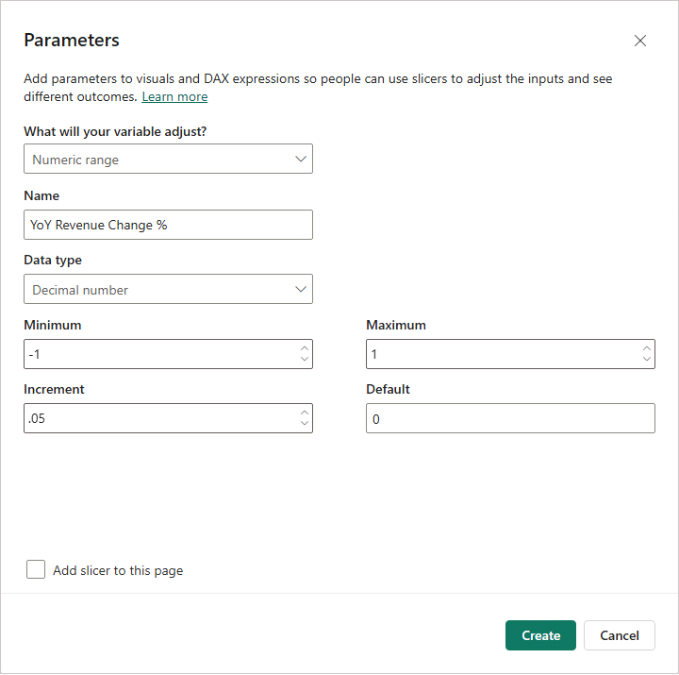
In Report view → Modeling → New parameter (Numeric range), create:
- YoY Revenue Change % (Decimal Number), Min = −1, Max = 1, Increment = 0.05, Default = 0
- YoY COGS Change % — same settings
- YoY Opex Change % — same settings
- USD Fx Change % — same settings
Uncheck Add slicer to this page, then click Create. Microsoft Power BI adds small single-value tables for each parameter.
Treat these parameters as assumptions. For organization, move your existing Actuals measures into an Actuals display folder, and future measures into a Forecast folder under Measures_Table.
Step 7b. Building the Forecast Calculations.
The DAX measures below combine prior-year actuals, year-over-year assumptions, and FX adjustments to project revenue, costs, and profitability across forecast periods.
Prior-year actuals for each KPI
Revenue (PY Actual) =
CALCULATE ( [Revenue (Actual)], DATEADD ( Calendar[Date], -1, YEAR ) )

COGS (PY Actual) =
CALCULATE ( [COGS (Actual)], DATEADD ( Calendar[Date], -1, YEAR ) )

OPEX (PY Actual) =
CALCULATE ( [OPEX (Actual)], DATEADD ( Calendar[Date], -1, YEAR ) )
What they do: Shift context back one year to fetch last year’s actuals for each month.
FX adjustment factor (applies inverse of USD change)
FX Adj Factor (Non-US) =
VAR FxPct = SELECTEDVALUE ( 'USD Fx Change %'[USD Fx Change %], 0 )
RETURN DIVIDE ( 1, 1 + FxPct, 1 )
Example: If EUR revenue is 110 and USD appreciates by +10% (FxPct = 0.10), factor = 1 / 1.10, so the USD reporting amount decreases (110 ÷ 1.10 = 100).
Revenue forecast (YoY + FX, forecast months only)
Revenue (Forecast) =
VAR YoY  = SELECTEDVALUE ( 'YoY Revenue Change %'[YoY Revenue Change %], 0 )
VAR FxF  = [FX Adj Factor (Non-US)]
RETURN
CALCULATE (
    SUMX (
        VALUES ( Subsidiary[Subsidiary] ),
        VAR Subs    = Subsidiary[Subsidiary]
        VAR PyThis  = CALCULATE ( [Revenue (PY Actual)] )   // respects current filters
        VAR FxAdj   = IF ( Subs <> "US", FxF, 1 )
        RETURN PyThis * ( 1 + YoY ) * FxAdj
    ),
    KEEPFILTERS ( Calendar[IsForecast] = TRUE() )
)
What it does: Starts from PY actuals per Subsidiary, applies YoY change, then applies FX adjustment if the Subsidiary is non-US; limits results to forecast months.
COGS and OPEX forecasts (YoY + FX)
COGS (Forecast) =
VAR YoY  = SELECTEDVALUE ( 'YoY COGS Change %'[YoY COGS Change %], 0 )
VAR FxF  = [FX Adj Factor (Non-US)]
RETURN
CALCULATE (
    SUMX (
        VALUES ( Subsidiary[Subsidiary] ),
        VAR Subs    = Subsidiary[Subsidiary]
        VAR PyThis  = CALCULATE ( [COGS (PY Actual)] )
        VAR FxAdj   = IF ( Subs <> "US", FxF, 1 )
        RETURN PyThis * ( 1 + YoY ) * FxAdj
    ),
    KEEPFILTERS ( Calendar[IsForecast] = TRUE() )
)

OPEX (Forecast) =
VAR YoY  = SELECTEDVALUE ( 'YoY Opex Change %'[YoY Opex Change %], 0 )
VAR FxF  = [FX Adj Factor (Non-US)]
RETURN
CALCULATE (
    SUMX (
        VALUES ( Subsidiary[Subsidiary] ),
        VAR Subs    = Subsidiary[Subsidiary]
        VAR PyThis  = CALCULATE ( [OPEX (PY Actual)] )
        VAR FxAdj   = IF ( Subs <> "US", FxF, 1 )
        RETURN PyThis * ( 1 + YoY ) * FxAdj
    ),
    KEEPFILTERS ( Calendar[IsForecast] = TRUE() )
)
What they do: Same structure as Revenue — use PY actuals, apply YoY %, then FX for non-US entities; restrict to forecast months.
Profit and margins (Forecast)
Gross Profit (Forecast) =
[Revenue (Forecast)] + [COGS (Forecast)]

Gross Profit Margin % (Forecast) =
DIVIDE ( [Gross Profit (Forecast)], [Revenue (Forecast)] )

Operating Profit (Forecast) =
[Gross Profit (Forecast)] + [OPEX (Forecast)]

Operating Profit Margin % (Forecast) =
DIVIDE ( [Operating Profit (Forecast)], [Revenue (Forecast)] )

Amount (Forecast) =
[Revenue (Forecast)] + [COGS (Forecast)] + [OPEX (Forecast)]
What they do: Assemble forecast totals and margins from the category forecasts.
Next, we’ll turn these assumptions into an interactive forecast dashboard with sliders for the parameters, a monthly forecast matrix, and visuals that compare actuals vs. forecast.
Step 8. Forecast — Power BI Dashboard and Sensitivity
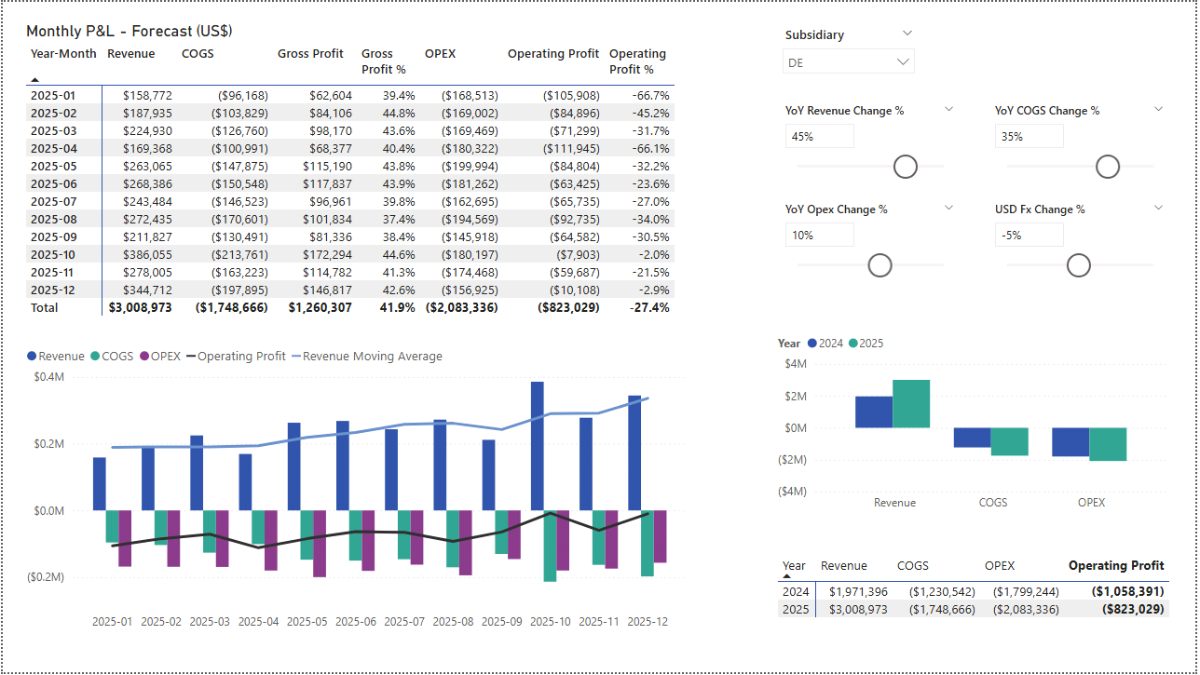
Create a new Forecast page in Report view. Insert a Matrix with Calendar[Year-Month] on Rows. In Values, place the forecast measures from Step 7: Revenue (Forecast), COGS (Forecast), OPEX (Forecast), Gross Profit (Forecast), and Operating Profit (Forecast), plus the margin measures if you want percentage context.
Right now the parameters use their default values. To make the page interactive, add slicers for your assumptions: go to Insert → Slicer, and add YoY Revenue Change %. In the slicer settings, choose Single value and enable the Slider. Repeat for YoY COGS Change %, YoY Opex Change %, and USD Fx Change %. Add a Subsidiary slicer (dropdown) to quickly test scenarios per country. Changing any slider should update the forecast matrix immediately.
Step 8b. Visualizing Profitability and Forecast Trends
For a combined visual of categories and profitability, add a Line and clustered column chart. Use MapAccounts[CommonCategory] for Columns, [Amount (Forecast)] for Column y-axis, and [Operating Profit (Forecast)] for Line y-axis.
You can optionally smooth the revenue signal with a moving average. There are two variants depending on whether you want to include actuals in the window:
DAX — 3M moving average (Forecast-only)
Revenue (Forecast, 3M MA) =
VAR LastVisibleDate =
    MAX ( Calendar[Date] )
VAR Window3M =
    DATESINPERIOD ( Calendar[Date], LastVisibleDate, -3, MONTH )
VAR Total3M =
    CALCULATE ( [Revenue (Forecast)], Window3M )
VAR MonthCount =
    CALCULATE ( DISTINCTCOUNT ( Calendar[Year-Month] ), Window3M )
RETURN
DIVIDE ( Total3M, MonthCount )
DAX — 3M moving average (Actuals + Forecast)
Revenue (Actual+Forecast, 3M MA) =
VAR Window3M =
    DATESINPERIOD ( Calendar[Date], MAX ( Calendar[Date] ), -3, MONTH )
VAR Total3M_AF =
    CALCULATE (
        SUMX (
            VALUES ( Calendar[Year-Month] ),
            COALESCE ( [Revenue (Actual)], [Revenue (Forecast)] )
        ),
        Window3M
    )
VAR MonthCount =
    CALCULATE ( DISTINCTCOUNT ( Calendar[Year-Month] ), Window3M )
RETURN
DIVIDE ( Total3M_AF, MonthCount )
For a year-level comparison, insert a Clustered column chart. Put MapAccounts[CommonCategory] on the X-axis and Calendar[Year] on Legend. Use the combined measure below on Y-axis:
DAX — Amount that stitches Actuals and Forecast together
Amount (Actual+Forecast) =
COALESCE ( [Actual Amount], [Amount (Forecast)] )
What it does: Returns Actuals when they exist; otherwise uses Forecast. This creates a seamless series for visuals and tables.
You can build similar stitched measures for specific KPIs and margins:
Revenue (Actual+Forecast) =
COALESCE ( [Revenue (Actual)], [Revenue (Forecast)] )

COGS (Actual+Forecast) =
COALESCE ( [COGS (Actual)], [COGS (Forecast)] )

Operating Profit (Actual+Forecast) =
COALESCE ( [Operating Profit (Actual)], [Operating Profit (Forecast)] )

Gross Profit Margin % (Actual+Forecast) =
VAR GP_AF  = COALESCE ( [Gross Profit (Actual)],  [Gross Profit (Forecast)] )
VAR Rev_AF = COALESCE ( [Revenue (Actual)], [Revenue (Forecast)] )
RETURN DIVIDE ( GP_AF, Rev_AF )

Operating Profit Margin % (Actual+Forecast) =
VAR OP_AF  = COALESCE ( [Operating Profit (Actual)], [Operating Profit (Forecast)] )
VAR Rev_AF = COALESCE ( [Revenue (Actual)], [Revenue (Forecast)] )
RETURN DIVIDE ( OP_AF, Rev_AF )
With the sliders (assumptions), stitched measures, and a mix of matrix + charts, you can run quick sensitivity analyses and see how projections respond under different scenarios.
Note: In order to keep labels in Power BI’s matrix at a certain order (i.e. Revenue, COGS, Operating Profit), go to the Power Query Editor, select the MapAccounts table, and click the Conditional Column icon from the Add Column tab. Name the new column CategorySortOrder and then add clauses as follows: if CommonCategory equals Revenue then the output is 1; else if COGS then 2; else if OPEX then 3.
= Table.AddColumn(#"Added Custom", "CategorySortOrder", each if [CommonCategory] = "Revenue" then 1 else if [CommonCategory] = "COGS" then 2 else if [CommonCategory] = "OPEX" then 3 else null)
Close and apply the Power Query Editor. Then, in Table view, select the MapAccounts[CommonCategory] column, click the Sort by column icon in the Column tools tab, and choose CategorySortOrder.
📌 Recap: Building a Consolidated P&L and Forecast Dashboard in Microsoft Power BI
Here’s a quick recap of the steps we followed to build a complete Profit & Loss consolidation and forecasting model in Microsoft Power BI:
- Load and Append Data. Import Fact tables from subsidiaries and combine them into a single consolidated dataset.
- Add Mapping Tables and Create Relationships. Load MapAccounts, FxRates, and a Calendar table, then link them to Data_Consolidated.
- Show Consolidated Profit & Loss. Convert local amounts to a reporting currency and create core measures for consolidated financials.
- Profitability Measures and Analysis. Define Gross Profit, Operating Profit, and margin measures; analyze by month and subsidiary.
- Variance Analysis and Client Profitability. Add MoM variance measures and evaluate top revenue clients and least-profitable clients.
- Build Dashboards. Combine clustered/line charts, treemaps, matrices, and slicers for an interactive P&L dashboard.
- Set Up Forecast Parameters. Create parameters for YoY Revenue, COGS, OPEX, and USD FX assumptions.
- Forecast Dashboard and Sensitivity. Build Actual vs. Forecast visuals, add sliders, moving averages, and stitched measures for scenario testing.
By following these steps, you’ve created a flexible model in Microsoft Power BI that consolidates multi-subsidiary accounts, analyzes profitability, and produces scenario-driven forecasts.
🔎 Preview the Interactive Consolidated P&L Dashboard
Explore the finished multi-subsidiary P&L & forecast dashboard—the same build from this tutorial. Compare Revenue, COGS, and OPEX, review Gross/Operating Profit, and test 12-month assumptions.
📥 Download My Consolidated P&L Forecast Dashboard Template
To help you practice quickly, I’ve prepared a ready-to-use package that includes everything you need:
- Power BI (.pbix) file with the full consolidated P&L and forecasting model, including data model, relationships, currency conversion logic, DAX measures, and dashboards.
- CSV data sources (Fact files for subsidiaries, mapping table, FX rates) so you can instantly load and explore the model.
- Text file with all DAX measures neatly organized for reference and reuse.
This package lets you consolidate financials across subsidiaries, analyze profitability, and experiment with different forecast assumptions directly in Microsoft Power BI.
Secure Checkout | Instant Download | 30-Day Money-Back Guarantee
Secure Checkout | Instant Download | 30-Day Money-Back Guarantee
Get in Touch

Hi, I’m Jacek. I’m passionate about Microsoft Power BI, DAX, and financial analytics! I hope this tutorial gave you a clear framework for building a consolidated P&L model and scenario-based forecasting.
Feel free to get in touch if you have any questions about Microsoft Power BI, forecasting, or data transformation techniques.
You can also explore my other tutorials for more hands-on guides or check out my One-to-One Training and Data Analytics Support if you need personalized help.
Disclaimer: This tutorial is for informational and educational purposes only and should not be considered professional advice.
Explore More Tutorials
- Power BI Financial Planning & Analysis Dashboard Tutorial — Build a fully integrated FP&A model in Microsoft Power BI, combining P&L, cash flow, balance sheet, and forecasting logic into a dynamic planning dashboard.
- Power BI Project Cost Allocation Dashboard Tutorial — Explore how to allocate project costs, evaluate profitability, and run forecasts using DAX-driven metrics and interactive dashboards.
- Power BI Sales Analysis & Forecast Dashboard Tutorial — A complete sales analytics workflow, including DAX measures, product-level KPIs, trend analysis, and what-if forecasting parameters.
- Excel Mergers & Acquisition (M&A) Model Tutorial – A step-by-step guide to creating a full M&A financial model, covering deal structure, purchase price allocation, synergy modeling, and consolidated financial projections.
- Python + Excel: Data Consolidation & Transformation — Discover how to automate multi-file consolidation and reporting workflows using Python scripts integrated with Excel spreadsheets.