Last Updated on March 1, 2026
In this tutorial, we will build a complete project planning and project cost management dashboard in Microsoft Power BI using a realistic construction-style dataset. The example is based on a construction project plan, but the same approach works just as well for IT projects, consulting engagements, manufacturing rollouts, or any workstream that needs a structured project timeline and cost tracking.
We’ll walk through loading and validating project plan datasets, building a clean data model, creating the DAX measures that drive baseline cost and hours analysis, and extending the model with scenario planning. By the end, you’ll have a dashboard that explains what drives cost, when those costs hit the timeline, and how delays or inflation change the project outlook—providing the visibility needed for project cost mitigation and scenario testing.
🔎 You can preview the dashboard to follow along or watch my Project Planning & Costing Dashboard Video Tutorial at the end of this tutorial.
Table of Contents
Step 1. Load the Project Plan Data into Microsoft Power BI
In this first step, we’ll bring the project planning datasets into Microsoft Power BI, quickly validate the key fields, and create a dynamic calendar table that will anchor the project timeline, project cost modelling, and later scenario analysis. Although the demo data is a real estate build (activities, labor, materials, and milestone payments), everything we do here is intentionally generic—so you can reuse the same structure for any project plan that has activities, resources, rates, and milestone payments.
Step 1a. Import and Review the Project Plan Files
Open Microsoft Power BI Desktop and load each CSV file (Home → Get Data → Text/CSV), so we can confirm the dataset structure before we start modelling.
For this Project Planning and Costing Management Dashboard, I used the following five source files:
- project_plan — 24 construction activities across eight phases (your baseline project plan and project timeline)
- project_resources — labor and material quantities for each activity (your usage drivers for cost)
- labor_rates — hourly cost of seven construction labor roles (labor pricing assumptions)
- material_costs — unit cost of ten common building materials (material pricing assumptions)
- payment_milestones — six milestone payments tied to major construction stages (a simple project cash-in schedule)
📥 You can download the source files and the completed Power BI dashboard file at the end of this tutorial.
After loading the tables, switch to Data view and do a quick quality check. This doesn’t need to be perfect modelling yet—we’re just making sure Microsoft Power BI interprets the columns the way we expect:
- Dates → set to Date (StartDate, EndDate, DueDate)
- Quantities → Whole number
- Costs / Rates → Decimal number
- IDs / Names → Text
This small validation step saves time later, because DAX time-intelligence and relationship behaviour depends heavily on having clean, consistent data types.
Step 1b. Minimal Power Query Checks
Open Transform Data to access Power Query.
Unlike operational exports, the files in this tutorial are already structured for modelling, so you only need a few quick checks:
- Confirm all date fields are typed as Date
- project_plan → StartDate, EndDate
- payment_milestones → DueDate
- Confirm numeric fields are typed correctly
- Qty (project_resources)
- AvgHourlyRate
- UnitCost
- PaymentAmount
When you’re done, click Close & Apply to load the tables into Microsoft Power BI.
Step 1c. Dynamic DAX Calendar for a Project Timeline
Project timelines rarely stay inside a neat, fixed window—especially when you start testing delay scenarios. That’s why we’ll build a dedicated calendar table using DAX, rather than relying on CALENDARAUTO(). Here, we deliberately extend the date range with a buffer (6 months before the earliest baseline date and up to 5 years after the latest baseline date), so the model can still phase cost and cash flow correctly when the project plan stretches in the scenario planning section.
In this context, DAX is doing two important jobs for us: first it detects the baseline date range from your project plan and milestone schedule, and then it generates a reusable time dimension with Year/Month/Quarter attributes that every visual and measure can share consistently.
Go to Modeling → New Table and enter the following:
Calendar =
VAR MinProjStart =
    MINX ( project_plan, project_plan[StartDate] )
VAR MaxProjEnd =
    MAXX ( project_plan, project_plan[EndDate] )

VAR MinMilestoneDate =
    MINX ( payment_milestones, payment_milestones[DueDate] )
VAR MaxMilestoneDate =
    MAXX ( payment_milestones, payment_milestones[DueDate] )

-- Baseline window: what you consider your "current plan" horizon
VAR BaseStart =
    MIN ( MinProjStart, MinMilestoneDate )
VAR BaseEnd =
    MAX ( MaxProjEnd, MaxMilestoneDate )

-- Extended window for scenarios (buffer)
VAR StartDate =
    EDATE ( BaseStart, -6 )      -- 6 months before baseline
VAR EndDate =
    EDATE ( BaseEnd, 60 )        -- 5 years after baseline

RETURN
ADDCOLUMNS (
    CALENDAR ( StartDate, EndDate ),
    "Year", YEAR ( [Date] ),
    "Month", MONTH ( [Date] ),
    "Month Name", FORMAT ( [Date], "MMMM" ),
    "Year-Month", FORMAT ( [Date], "YYYY-MM" ),
    "MonthStart", DATE ( YEAR ( [Date] ), MONTH ( [Date] ), 1 ),
    "MonthEnd", EOMONTH ( [Date], 0 ),
    "MonthIndex", YEAR ( [Date] ) * 12 + MONTH ( [Date] ),
    "Quarter", "Q" & QUARTER([Date]),
    "QuarterStart",
        DATE(
            YEAR([Date]),
            1 + ( (QUARTER([Date]) - 1) * 3 ),
            1
        ),
    "QuarterEnd",
        EOMONTH(
            DATE(
                YEAR([Date]),
                3 + ( (QUARTER([Date]) - 1) * 3 ),
                1
            ),
            0
        ),
    "YearStart", DATE ( YEAR([Date]), 1, 1 ),
    "YearEnd", DATE ( YEAR([Date]), 12, 31 ),
    "Week Number", WEEKNUM ( [Date] ),
    "Day of Week", FORMAT ( [Date], "dddd" ),
    "Day of Week Num", WEEKDAY ( [Date], 2 ),
    -- flag for baseline-only visuals (your "actual" plan window)
    "IsActual",
        IF ( [Date] >= BaseStart && [Date] <= BaseEnd, TRUE (), FALSE () ),

    -- optional helper: TRUE only for dates outside the baseline window
    "IsScenarioOnly",
        IF ( [Date] < BaseStart || [Date] > BaseEnd, TRUE (), FALSE () )
)
After creating the table, right-click Calendar → Mark as date table and select the Date column. This tells Microsoft Power BI to treat it as the primary date dimension, which is essential for clean time-based grouping and reliable time-intelligence behaviour later.
Step 2. Build the Project Planning Data Model in Microsoft Power BI
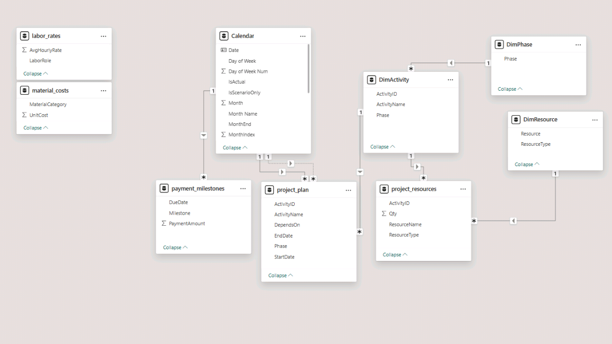
We’ll now build a clean star schema so Microsoft Power BI can slice the project plan correctly by time, phase, activity, and resource. This step underpins everything that follows in the tutorial. A tidy, predictable data model ensures that project timeline visuals, project cost management measures, and later project cost scenario analysis all behave consistently as the model grows.
Open Model view (left sidebar → the table diagram icon), then arrange the model so your dimension tables sit at the top and your fact tables sit at the bottom. This layout is not just aesthetic—it makes it much easier to spot relationship issues once the dashboard grows.
Step 2a. Connect the Core Fact Tables
We’ll start by connecting your time dimension (Calendar) to the two tables that are naturally date-driven: the project plan schedule and the payment milestones.
Calendar → project_plan (StartDate)
Relationship: Calendar[Date] → project_plan[StartDate]
Cardinality: One-to-many
Cross filter direction: Single
Active: Yes
This relationship anchors activity scheduling, supports your Gantt-style timeline later, and is also used when we time-phase cost and hours across the project plan.
Calendar → payment_milestones (DueDate)
Relationship: Calendar[Date] → payment_milestones[DueDate]
Cardinality: One-to-many
Cross filter direction: Single
Active: Yes
This relationship controls when milestone payments appear on the timeline, which becomes important once we build cash-flow visuals and test payment-delay scenarios.
Step 2b. Create Lightweight DAX Dimension Tables
To improve filtering and keep visuals readable, we’ll add three small dimension tables using DAX. In this context, DAX isn’t calculating KPIs yet—its role here is to create clean lookup tables so you can build hierarchies, slicers, and charts without repeating fields from the larger fact tables.
Phase Dimension (DimPhase)
DimPhase =
DISTINCT (
    SELECTCOLUMNS (
        project_plan,
        "Phase", project_plan[Phase]
    )
)
Activity Dimension (DimActivity)
This table contains one row per activity, plus its phase. It becomes the backbone of a Phase → Activity hierarchy for project planning visuals.
DimActivity =
DISTINCT (
    SELECTCOLUMNS (
        project_plan,
        "ActivityID", project_plan[ActivityID],
        "ActivityName", project_plan[ActivityName],
        "Phase", project_plan[Phase]
    )
)
Resource Dimension (DimResource)
This combines labor roles and material categories into a single resource table so you can build unified slicers and breakdowns (for example, one matrix that can filter to either Labor or Material).
DimResource =
UNION (
    SELECTCOLUMNS (
        labor_rates,
        "Resource", labor_rates[LaborRole],
        "ResourceType", "Labor"
    ),
    SELECTCOLUMNS (
        material_costs,
        "Resource", material_costs[MaterialCategory],
        "ResourceType", "Material"
    )
)
Step 2c. Add Relationships for the Dimension Tables
Now connect your new dimensions so they filter the fact tables cleanly:
DimPhase → DimActivity
DimPhase[Phase] → DimActivity[Phase]
One-to-many, single direction
DimActivity → project_plan
DimActivity[ActivityID] → project_plan[ActivityID]
DimActivity → project_resources
DimActivity[ActivityID] → project_resources[ActivityID]
This link lets activities drive their labor and material requirements, which becomes the foundation for project cost management and staffing calculations.
DimResource → project_resources
DimResource[Resource] → project_resources[ResourceName]
Optional (but recommended)
Add an inactive relationship so we can reference planned end dates when needed without breaking the main date path:
Calendar[Date] → project_plan[EndDate]
One-to-many, inactive
At this point, the model is ready for measure work: costs, hours, phasing logic, and scenario planning will all flow through the same controlled set of relationships.
Note: To maintain a clean, predictable star schema, go to File → Options and Settings → Options → Current File → Data Load and uncheck “Autodetect new relationships after data is loaded.” This prevents Microsoft Power BI from creating unintended joins (for example, between date-like columns that happen to look similar across tables).
Step 3. Baseline Project Cost and Hours Analysis (DAX Measures)
Now that the project planning data model is in place, we can start building the measures that power the rest of the Power BI dashboard. In this step, we’ll create the baseline DAX measures for labor cost, material cost, and total cost, and then introduce the phasing logic that spreads those costs and quantities across the project timeline.
To keep the file organised as the number of measures grows (especially once we add project cost scenario logic later), we’ll store everything in a dedicated measures table. In Report view, go to Home → Enter Data, name the table Measures_Table, and click Load. Then right-click Measures_Table and choose New measure for each expression below.
Step 3a. Foundational DAX Measures
These first measures are dependencies: they establish the unit pricing and the line-level cost, which everything else aggregates later.
Unit Rate
This measure retrieves the correct unit rate for each resource row in project_resources, based on whether the row represents labor or material. In practice, it’s the price lookup that links your project plan resource consumption to the rates tables, which is essential for project cost management.
A quick note on the DAX functions used here: SWITCH(TRUE()) lets us write clear, readable “if/else” logic, while CALCULATE changes the filter context so Microsoft Power BI can fetch the matching rate from the correct table (labor_rates or material_costs).
Unit Rate =
VAR Resource = SELECTEDVALUE ( project_resources[ResourceName] )
VAR ResourceType = SELECTEDVALUE ( project_resources[ResourceType] )
RETURN
SWITCH (
    ResourceType,
    "Labor",
        LOOKUPVALUE (
            labor_rates[AvgHourlyRate],
            labor_rates[LaborRole], Resource
        ),
    "Material",
        LOOKUPVALUE (
            material_costs[UnitCost],
            material_costs[MaterialCategory], Resource
        )
)
Resource Cost
This is the line-level cost for each row in project_resources: quantity multiplied by the unit rate. It becomes the building block for totals, phase summaries, and any later project cost scenario comparisons.
Here DAX is simply reusing the [Unit Rate] measure so you maintain one consistent definition of pricing across the entire model.
Resource Cost =
SUMX (
    project_resources,
    project_resources[Qty] * [Unit Rate]
)
Step 3b. Summary Cost Measures
With line-level cost in place, we can create the baseline summary measures for labor, materials, and total project cost.
Labor Cost
This measure sums cost only for labor rows. CALCULATE (external link) applies a filter on ResourceType, so the same underlying [Resource Cost] rolls up cleanly into a labor-only total.
Labor Cost =
CALCULATE (
    [Resource Cost],
    project_resources[ResourceType] = "Labor"
)
Material Cost
This is the same idea, but for materials. Using the same pattern keeps your project cost management logic consistent and easy to audit.
Material Cost =
CALCULATE (
    [Resource Cost],
    project_resources[ResourceType] = "Material"
)
Total Cost
This measure simply combines labor and material totals to return the baseline project cost for the entire project plan.
Total Cost = [Labor Cost] + [Material Cost]Step 3c. Time-Phased Cost and Quantity Across the Project Timeline
A total cost number is useful, but project planning decisions usually depend on when that cost occurs. In this section, we create time-phased measures that distribute cost and quantities across the project timeline, based on each activity’s StartDate and EndDate.
Before we phase anything, we’ll add a small helper measure that controls whether the phasing logic uses weekdays only (a five-day working week) or all days (a seven-day calendar week). This is a simple switch, but it becomes very practical later when you compare scenarios or want to align the model with your real project working pattern.
Weekdays Only
Weekdays Only = 1
Time-Phased Cost (Base)
This measure distributes each resource line’s total cost across the calendar dates that fall inside the activity’s start/end window. In other words, it converts total cost per activity into daily cost along the project timeline, which is what makes monthly and annual cost visuals possible.
In terms of DAX mechanics, SUMX iterates row-by-row (first across project_resources, then across Calendar). REMOVEFILTERS(‘Calendar’) makes sure we always fetch the activity’s true start/end dates, even when a visual is already filtered to a particular month or year.
Time-Phased Cost (Base) =
VAR weekdays_only =
    [Weekdays Only] -- change to 0 for 7-day phasing
RETURN
    SUMX (
        project_resources,
        VAR ActivityID =
            project_resources[ActivityID]
        VAR StartDate =
            CALCULATE (
                MIN ( project_plan[StartDate] ),
                project_plan[ActivityID] = ActivityID,
                REMOVEFILTERS ( 'Calendar' )
            )
        VAR EndDate =
            CALCULATE (
                MIN ( project_plan[EndDate] ),
                project_plan[ActivityID] = ActivityID,
                REMOVEFILTERS ( 'Calendar' )
            )
        -- total calendar days
        VAR TotalDays =
            DATEDIFF ( StartDate, EndDate, DAY ) + 1
        -- total weekdays in the span
        VAR WeekdayCount =
            CALCULATE (
                COUNTROWS ( 'Calendar' ),
                'Calendar'[Date] >= StartDate,
                'Calendar'[Date] <= EndDate,
                WEEKDAY ( 'Calendar'[Date], 2 ) <= 5
            )
        VAR Duration =
            IF ( weekdays_only = 1, WeekdayCount, TotalDays )
        VAR ResourceTotalCost =
            project_resources[Qty] * [Unit Rate]
        VAR DailyRate =
            DIVIDE ( ResourceTotalCost, Duration )
        RETURN
            SUMX (
                'Calendar',
                IF (
                    'Calendar'[Date] >= StartDate
                        && 'Calendar'[Date] <= EndDate
                        && (
                            weekdays_only = 0
                                || WEEKDAY ( 'Calendar'[Date], 2 ) <= 5
                        ),
                    DailyRate,
                    BLANK ()
                )
            )
    )
Time-Phased Qty (Base)
This measure uses the same phasing engine, but instead of spreading cost, it spreads the quantity (hours for labor rows, units for material rows). That makes it the foundation for staffing and resource loading visuals later in the Power BI dashboard.
The key idea is consistency: when cost and quantity share the same phasing logic, your project cost management visuals and your project timeline visuals stay aligned.
Time-Phased Qty (Base) =
VAR weekdays_only =
    [Weekdays Only] -- change to 0 for 7-day phasing
RETURN
    SUMX (
        project_resources,
        VAR ActivityID =
            project_resources[ActivityID]
        VAR StartDate =
            CALCULATE (
                MIN ( project_plan[StartDate] ),
                project_plan[ActivityID] = ActivityID,
                REMOVEFILTERS ( 'Calendar' )
            )
        VAR EndDate =
            CALCULATE (
                MIN ( project_plan[EndDate] ),
                project_plan[ActivityID] = ActivityID,
                REMOVEFILTERS ( 'Calendar' )
            )
        -- total calendar days in the activity duration
        VAR TotalDays =
            DATEDIFF ( StartDate, EndDate, DAY ) + 1
        -- weekdays only (if applicable)
        VAR WeekdayCount =
            CALCULATE (
                COUNTROWS ( 'Calendar' ),
                'Calendar'[Date] >= StartDate,
                'Calendar'[Date] <= EndDate,
                WEEKDAY ( 'Calendar'[Date], 2 ) <= 5
            )
        VAR Duration =
            IF ( weekdays_only = 1, WeekdayCount, TotalDays )
        VAR DailyQty =
            DIVIDE ( project_resources[Qty], Duration )
        RETURN
            SUMX (
                'Calendar',
                IF (
                    'Calendar'[Date] >= StartDate
                        && 'Calendar'[Date] <= EndDate
                        && (
                            weekdays_only = 0
                                || WEEKDAY ( 'Calendar'[Date], 2 ) <= 5
                        ),
                    DailyQty,
                    BLANK ()
                )
            )
    )
These two time-phased measures drive the time-based cost, hours, and quantity visuals we’ll build on the dashboard pages in the next steps.
Step 4. Build the Cost, Revenue, and Hours Overview Page
On the first report page, we’ll create a high-level overview that brings together the most important baseline outputs from the project plan. The purpose of this page is to answer three fundamental project planning questions: how much the project costs, how those costs are split between labor and materials, and when those costs occur across the project timeline. This makes it a natural entry point for project cost management discussions before moving into more detailed resource planning or scenario analysis later in the tutorial.
From a Power BI perspective, this page also acts as a validation checkpoint. If totals, splits, and timelines look sensible here, you can be confident that the data model and DAX measures built in the earlier steps are behaving as expected.
Step 4a. Cost and Revenue Summary Cards (Card Visuals)
We’ll start with a set of summary cards at the top of the page to display the headline numbers for the project. These cards give a quick snapshot of total project cost and its main components, making it easy to validate the baseline figures at a glance before drilling into detailed visuals.
In Power BI’s Report view, go to the Insert tab and add Card (new) visuals. Use the Total Cost, Labor Cost, and Material Cost measures as the primary cards. If you are also including revenue and hours on this overview page, add additional cards using the Revenue and Labor Hours measures.
At this stage, formatting can remain simple. Use a currency display such as $1,234,567 for cost-related cards, apply a consistent background color if you plan to style the dashboard later, and adjust label text using Rename for this visual if you want cleaner, presentation-ready names.
Step 4b. Total Cost by Project Phase (Stacked Bar Chart)
Next, we’ll visualise how total cost is distributed across the phases of the project plan, while also separating labor and material contributions. This view is especially useful for identifying which phases are cost-heavy and understanding whether those costs are driven primarily by staffing or by materials.
In Report view, insert a Stacked Bar Chart. Place project_plan[Phase] on the Y-axis and Total Cost on the X-axis. Use project_resources[ResourceType] as the legend so labor and material costs are shown as separate segments within each phase. The result is a compact visual that clearly communicates both scale and composition of cost by phase.
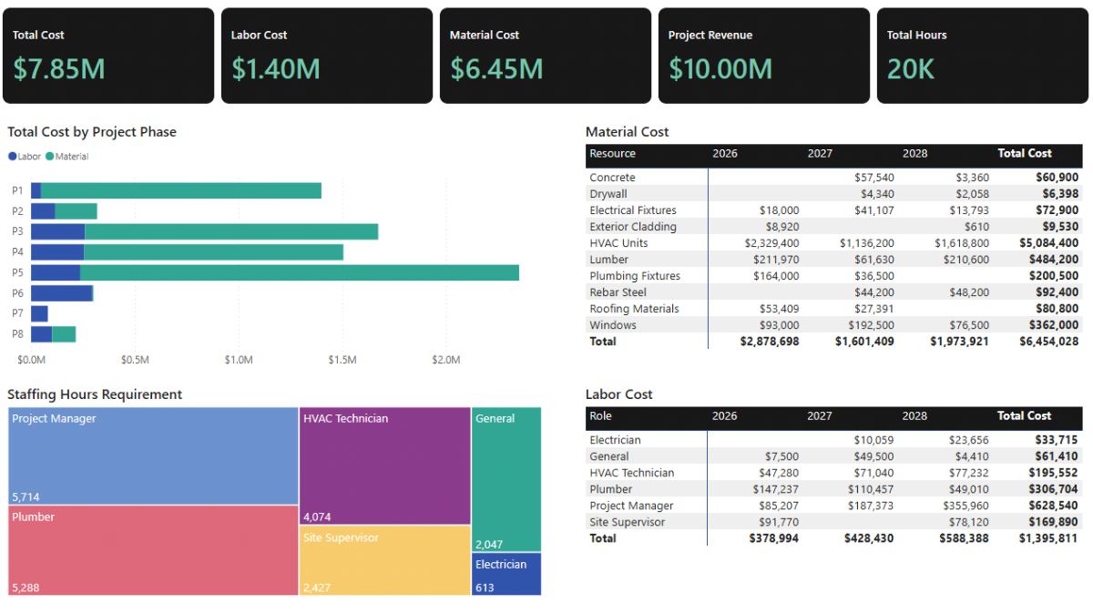
Step 4c. Material Cost Annual Breakdown (Matrix)
To understand when material costs occur over the life of the project, we’ll add a matrix that breaks material spend down by year and by material category. Because this visual uses the time-phased baseline cost measure, it reflects the project timeline rather than simply summing total material cost.
Add a Matrix visual in Report view. Use Calendar[Year] on the columns, and place ResourceType followed by ResourceName on the rows to create a clear hierarchy. For the values, use Time-Phased Cost (Base).
If the default labels feel too technical, you can right-click any field in the visual and select Rename for this visual to adjust how it appears to the end user. In the Format pane, set the values to currency format and enable Subtotals so yearly totals are easy to interpret. Finally, apply a visual-level filter so DimResource[ResourceType] is set to Material. This ensures the matrix shows material costs only.
Step 4d. Labor Cost Annual Breakdown (Matrix)
The labor cost annual breakdown follows the same structure as the material matrix, but focuses on staffing-related spend. This visual is often where discrepancies in the project plan become visible, as labor cost patterns tend to highlight phases with intensive staffing requirements.
Create another Matrix visual and again use Calendar[Year] on the columns, with ResourceType and ResourceName on the rows. Use Time-Phased Cost (Base) as the value. As before, set the values to currency format and enable subtotals in the Format pane. Apply a visual-level filter so DimResource[ResourceType] is set to Labor.
Using the same structure for both material and labor matrices makes it easier to compare patterns across cost types and keeps the dashboard visually consistent.
Step 4e. Staffing Hours Requirement (Treemap)
Finally, we’ll add a high-level view of staffing demand using a treemap. This visual shows which roles account for the largest share of labor hours in the baseline project plan, providing context that cost-based visuals alone may not reveal.
In Report view, insert a Treemap visual. Use DimResource[Resource] as the detail field and Labor Hours as the value. The size of each rectangle represents the relative staffing requirement by role, making it easy to see which resources dominate the workload.
If you haven’t created the Labor Hours measure yet, you can leave this visual empty for now and return to it in Step 5, where we introduce time-phased labor hours as part of resource and cash-flow planning.
Step 5. Resource and Cash-Flow Planning
In this step, we extend the baseline project planning model into a more operational view by introducing resource loading and cash-flow logic. Up to this point, we’ve focused on understanding total cost and how it is distributed over time. Now we shift the focus to how much effort is required, when cash moves in and out of the project, and how those flows accumulate over the project timeline.
From a project cost management perspective, this step is where the dashboard starts to resemble a financial control tool rather than just a reporting view. We’ll build time-phased labor hours, convert costs and revenues into cash-flow terms, and create a unified structure that allows us to analyse cash movement and balance consistently across months, quarters, and years.
To keep the model manageable as complexity increases, it’s a good idea to use Display folders in the Measures table. Group baseline measures separately from scenario measures once we introduce them later, so navigation stays intuitive as the number of DAX expressions grows.
Step 5a. Additional DAX Measures for Resource Hours and Cash Flow
We’ll start by extending the baseline measures created earlier so the model can support staffing analysis and cash-flow reporting. These measures don’t change the underlying project plan; instead, they reinterpret existing quantities and costs through a time-phased and cash-flow lens.
Time-Phased Labor Hours
This measure reuses the existing Time-Phased Qty (Base) logic and simply filters it to labor resources. Because quantities for labor rows represent hours, the result is a daily and monthly distribution of staffing demand across the project timeline.
In DAX terms, CALCULATE applies a resource-type filter while preserving the same phasing logic you already validated for cost and quantities. This ensures staffing visuals stay perfectly aligned with the project schedule.
Time-Phased Labor Hours =
CALCULATE(
    [Time-Phased Qty (Base)],
    project_resources[ResourceType] = "Labor"
)
Revenue
This measure represents baseline project revenue based on the milestone payment schedule. At this stage, it simply sums the milestone amounts without any timing adjustment. We’ll later extend this logic to test payment delays in the scenario planning section.
Revenue = SUM(payment_milestones[PaymentAmount])Time-Phased Labor and Material Cost
These measures reuse the generic Time-Phased Cost (Base) engine and apply simple filters to split cost into labor and material components. This approach avoids duplicating complex logic and keeps cost definitions consistent across all visuals.
Time-Phased Labor Cost =
CALCULATE(
    [Time-Phased Cost (Base)],
    project_resources[ResourceType] = "Labor"
)
Cash-Flow Sign Convention for Costs
To present a readable cash-flow statement, costs are converted to negative values. This makes inflows (revenue) and outflows (costs) visually intuitive when displayed together in matrices and charts.
Labor CF = - [Time-Phased Labor Cost]

Material CF = - [Time-Phased Material Cost]
Total Cash Flow per Period
This measure aggregates all cash movements for a given period, returning the net inflow or outflow. It forms the basis for both period cash-flow reporting and cumulative cash balance calculations.
Revenue CF = [Revenue]Total CF = [Revenue CF] + [Labor CF] + [Material CF]Cash Balance (Cumulative Cash Flow)
This measure calculates the running cash balance over time. By removing the current calendar filter and re-applying it up to the current date context, it produces a cumulative view that works consistently across months, quarters, and years.
Cash Balance =
CALCULATE(
    [Total CF],
    FILTER(
        ALLSELECTED('Calendar'),
        'Calendar'[Date] <= MAX('Calendar'[Date])
    )
)
Step 5b. Cash-Flow Category Dimension and Unified Cash-Flow Measure
Before building cash-flow visuals, we’ll create a small helper dimension that controls the structure and ordering of cash-flow rows. This allows us to drive a clean matrix layout using a single value measure instead of multiple separate fields.
Cash-Flow Category Dimension
This static table defines the cash-flow rows and their display order.
DimCFCategories =
DATATABLE(
    "CFCategory", STRING,
    "SortOrder", INTEGER,
    {
        { "Revenue",      1 },
        { "Labor CF",    2 },
        { "Material CF",  3 },
        { "Total CF",     4 },
        { "Balance",      5 }
    }
)
After creating the table, set CFCategory to sort by SortOrder so the matrix displays rows in a logical financial order.
Unified Cash-Flow Value Measure
This SWITCH measure returns the appropriate value for each cash-flow category row. The advantage of this pattern is that you can drive the entire cash-flow matrix with a single measure, keeping visuals simpler and easier to maintain.
CF Value =
VAR Cat = SELECTEDVALUE(DimCFCategories[CFCategory])
RETURN
SWITCH(
    Cat,
    "Revenue",        [Revenue CF],
    "Labor CF",       [Labor CF],
    "Material CF",    [Material CF],
    "Total CF",       [Total CF],
    "Balance",   [Cash Balance],
    BLANK()
)
Step 5c. Resource and Cash-Flow Dashboard Page
We’ll now bring these measures together on a dedicated Cash Flow page. This page focuses on staffing demand and cash movement over time, complementing the cost overview built earlier.
Before adding visuals, go to the Filters pane and add Calendar[IsActual] as a page-level filter. Set it to TRUE so the visuals only display dates within the original project plan window and exclude any future scenario extension dates.
Staffing Hours Requirement Plan (Matrix)
This matrix shows time-phased labor hours by role across the project timeline. It effectively functions as a staffing plan, highlighting periods of high and low resource demand.
Use Calendar[Year] and Calendar[MonthStart] on the columns, project_resources[ResourceName] on the rows, and Time-Phased Labor Hours as the value. Formatting the month column as abbreviated text (Jan, Feb, Mar) helps keep the matrix compact, while background color gradients turn it into a visual heatmap of labor loading.
Project Cash-Flow Statement (Matrix)
This matrix presents a compact cash-flow statement by year and quarter, showing revenues, costs, net cash flow, and cumulative balance in one place.
Use DimCFCategories[CFCategory] on the rows, Calendar[Year] and Calendar[Quarter] on the columns, and CF Value as the value. Currency formatting and selective conditional formatting on the Total CF row help draw attention to net cash movement without overwhelming the layout.
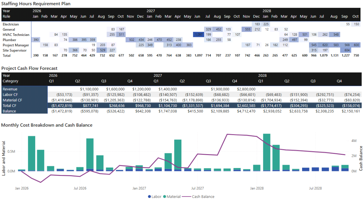
Monthly Cost Breakdown and Cash Balance (Combo Chart)
The final visual on this page combines monthly labor and material costs with the cumulative cash balance on a shared date axis. Stacked columns represent monthly cost burn, while a line shows how those costs affect the overall cash position.
Using a Line and Stacked Column Chart, place Calendar[MonthStart] on the X-axis, Time-Phased Labor Cost and Time-Phased Material Cost on the column values, and Cash Balance on the line values. Aligning the axes ensures the relationship between cost burn and cash balance remains visually accurate.
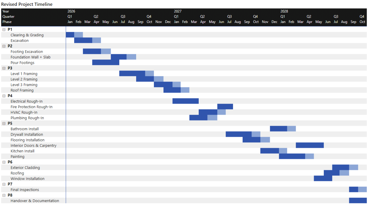
Step 6. Project Plan (Gantt Timeline)
In this step, we’ll visualise the full project plan as a Gantt-style timeline using native Power BI visuals. Rather than relying on a custom visual, we’ll build the timeline using a matrix and conditional formatting. This approach keeps the model transparent, avoids external dependencies, and integrates cleanly with the project planning and scenario logic we’ve already built.
The result is a project timeline that clearly shows when each activity starts and ends, how phases overlap, and how the overall schedule unfolds across months and quarters.
Step 6a. Create the “Is Active (Month)” Measure
Before building the timeline visual itself, we need a measure that tells Microsoft Power BI whether a given activity is active during a specific calendar month. This measure evaluates the activity’s start and end dates against the month currently in context and returns 1 when the activity is active and BLANK() otherwise.
Returning BLANK rather than zero is important. It keeps the matrix clean and ensures that only relevant months appear visually highlighted in the Gantt-style layout.
In DAX terms, this measure uses SELECTEDVALUE to retrieve the current activity and month, CALCULATE to fetch the activity’s true start and end dates (ignoring any existing calendar filters), and a simple logical test to determine overlap.
Is Active (Month) =
VAR MonthStart =
    SELECTEDVALUE ( 'Calendar'[MonthStart] )
VAR MonthEnd =
    EOMONTH ( MonthStart, 0 )

VAR ActivityID =
    SELECTEDVALUE ( DimActivity[ActivityID] )

VAR ActivityStart =
    CALCULATE (
        MIN ( project_plan[StartDate] ),
        project_plan[ActivityID] = ActivityID,
        REMOVEFILTERS ( 'Calendar' )
    )

VAR ActivityEnd =
    CALCULATE (
        MIN ( project_plan[EndDate] ),
        project_plan[ActivityID] = ActivityID,
        REMOVEFILTERS ( 'Calendar' )
    )

RETURN
IF (
        NOT ISBLANK ( ActivityID )
    && ActivityStart <= MonthEnd && ActivityEnd >= MonthStart,
    1,
    BLANK()
)
This measure will power the entire Gantt-style timeline.
Step 6b. Build the Gantt-Style Matrix (Matrix)
With the activity flag in place, we can now build the timeline visual itself. Conceptually, the matrix starts as a grid that shows a value of 1 in months where an activity is active. We then use conditional formatting to turn those values into horizontal blocks that visually read as a Gantt chart.
In Power BI’s Report view, insert a Matrix visual. Place DimPhase[Phase] and then DimActivity[ActivityName] on the rows to create a clear phase-to-activity hierarchy. On the columns, use Calendar[Year], Calendar[Quarter], and Calendar[MonthStart] so the timeline reads naturally from left to right. For the values, use the Is Active (Month) measure.
At this stage, the matrix will display 1s in the cells where an activity overlaps a given month. The next step is to convert those numeric indicators into visual blocks.
Step 6c. Apply Conditional Formatting to Create the Gantt Effect
To transform the matrix into a readable Gantt-style timeline, apply conditional formatting to the values.
Select the matrix, open the Format pane, and navigate to Cell elements → Conditional formatting (fx) → Background color. Choose Rules and set the rule so that when the value equals 1, a solid color (for example, blue) is applied. Leave all other values unformatted so they remain blank.
Repeat the same process for Font color, using a contrasting color such as white or a darker blue. This ensures the highlighted cells read as continuous bars rather than isolated numbers.
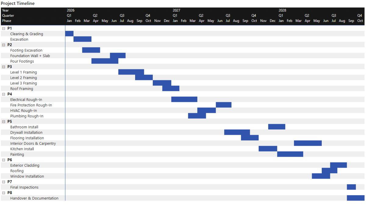
Step 6d. Format the Date Columns for Readability
By default, Calendar[MonthStart] displays full dates such as 2026-04-01, which quickly becomes unreadable in a timeline layout. To make the Gantt compact, change the display format of the MonthStart column.
Select Calendar[MonthStart] in the data model, go to Column tools → Format → Custom, and enter MMM. This displays month abbreviations such as Jan, Feb, and Mar. Because Year and Quarter are already shown above the month level, the abbreviated month format provides enough context while conserving horizontal space.
At this point, you should have a clean, readable project timeline that clearly shows activity sequencing and phase overlap across the project plan.
Step 7. Scenario Planning and Sensitivity Analysis
In this step, we layer a scenario engine on top of the baseline project model. The goal is not to predict the future with precision, but to understand sensitivity: how changes in schedule, productivity, prices, and payment timing affect project cost, cash flow, and staffing requirements.
From a project planning and project cost management perspective, this is where the dashboard becomes a decision-support tool. Instead of working with a single static project plan, we can test “what if” situations such as delays, inflation, or reduced productivity, and immediately see the downstream impact on cost, timeline, and cash balance.
We’ll build the scenario engine in three conceptual layers. First, we introduce What-If parameters that act as user-controlled inputs. Next, we translate those inputs into DAX multiplier measures that feed revised timeline, cost, and hours logic. Finally, we expose the results through scenario-specific measures that can be compared directly against the baseline plan.
Step 7a. Create What-If Parameters for Scenario Inputs
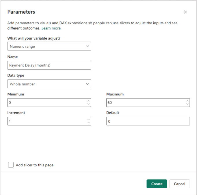
We’ll start by creating a set of What-If parameters that represent the most common project risks and uncertainties. These parameters will later appear as sliders on the Scenario Planning dashboard, allowing you to interactively test different assumptions without modifying any DAX code.
In Microsoft Power BI, go to the Modeling tab and select New parameter → Numeric range. Create four percentage-based parameters using the same configuration: a decimal number ranging from -1 to 1 (or 0 to 1 for Delay %), with an increment of 0.01, a default value of 0, and percentage formatting. These parameters represent proportional changes rather than absolute values.
Create the following percentage parameters:
- Delay %, representing schedule slippage
- Material Inflation %, representing changes in material prices
- Labor Inflation %, representing changes in labor rates
- Labor Inefficiency %, representing productivity loss that increases required labor hours
When creating each parameter, set Add slicer to this page to Off. We’ll place and style the sliders later on the Scenario Planning dashboard.
Next, create a separate parameter to control payment timing. This one represents a discrete shift in months rather than a percentage change.
Create a Whole number parameter called Payment Delay (Months), with a minimum of 0, a maximum of 60, an increment of 1, and a default value of 0. Again, leave the slicer off for now.
These parameters define the user-facing inputs of the scenario engine, but on their own they don’t yet affect the model. That logic comes next.
Step 7b. Create Scenario Multiplier Measures
The next step is to translate raw slider values into reusable multiplier measures. This keeps the rest of the DAX readable and ensures that scenario logic remains consistent across timeline, cost, and cash-flow calculations.
Each multiplier follows the same pattern: it takes the parameter value and converts it into a factor that can be applied directly to durations, quantities, or rates. COALESCE is used to safely handle cases where the parameter value might be blank.
Delay Multiplier = 1 + COALESCE ( 'Delay %'[Delay % Value], 0 )

Material Inflation Multiplier = 1 + COALESCE ( 'Material Inflation %'[Material Inflation % Value], 0 )

Labor Inflation Multiplier = 1 + COALESCE ( 'Labor Inflation %'[Labor Inflation % Value], 0 )

Labor Inefficiency Multiplier = 1 + COALESCE ( 'Labor Inefficiency %'[Labor Inefficiency % Value], 0 )

Payment Delays (Months) = COALESCE ( 'Payment Delay (Months)'[Payment Delay (Months) Value], 0 )
These measures don’t perform any calculations on their own. Instead, they act as inputs that will be referenced throughout the scenario logic, ensuring that all downstream effects stay aligned with the same assumptions.
Step 7c. Scenario Timeline Logic (Schedule Delay)
We’ll now apply the Delay % parameter to the project timeline. To keep the model intuitive and suitable for scenario testing, we use a simplified delay rule:
- Activity start dates remain anchored
- Activity durations increase by the delay percentage
- Activity end dates shift out accordingly
- Labor hours increase with delay (handled later in the quantity logic)
This approach avoids complex rescheduling logic while still capturing the essential impact of delays on cost and cash flow.
Adjusted Activity Duration
These measures recalculate the duration of each activity by applying the delay multiplier to the original number of days. In DAX terms, they first retrieve the baseline start and end dates, compute the original duration, and then scale that duration based on the scenario input.
Activity Start (Baseline) =
VAR ActivityID =
    SELECTEDVALUE ( DimActivity[ActivityID] )
RETURN
CALCULATE (
    MIN ( project_plan[StartDate] ),
    project_plan[ActivityID] = ActivityID,
    REMOVEFILTERS ( 'Calendar' )
)

Activity End (Baseline) =
VAR ActivityID =
    SELECTEDVALUE ( DimActivity[ActivityID] )
RETURN
CALCULATE (
    MIN ( project_plan[EndDate] ),
    project_plan[ActivityID] = ActivityID,
    REMOVEFILTERS ( 'Calendar' )
)

Activity Duration (Baseline Days) =
DATEDIFF (
    [Activity Start (Baseline)],
    [Activity End (Baseline)],
    DAY
) + 1

Activity Duration (Adjusted Days) =
[Activity Duration (Baseline Days)] * [Delay Multiplier]
Adjusted Activity End Date
Once the adjusted duration is known, we can derive the revised end date. Rounding is applied to ensure the result remains a valid whole number of days.
Activity End (Adjusted) =
VAR StartDate =
    [Activity Start (Baseline)]
VAR DurationAdj =
    [Activity Duration (Adjusted Days)]
VAR DaysAdj =
    ROUND ( DurationAdj, 0 )
RETURN
StartDate + DaysAdj - 1
Step 7d. Scenario Gantt Flag (Baseline vs. Extension)
To visualise how delays extend the project timeline, we introduce a scenario-aware activity flag. This measure distinguishes between months that belong to the original baseline schedule and months that exist only because of scenario-driven extensions.
The measure returns:
- 1 for months that overlap the baseline schedule
- 2 for months added due to delay
- BLANK() otherwise
This allows us to use conditional formatting later to visually separate baseline work from delayed extensions in the scenario Gantt chart.
Is Active (Month Scenario) =
VAR MonthStart =
    SELECTEDVALUE ( 'Calendar'[MonthStart] )
VAR MonthEnd =
    EOMONTH ( MonthStart, 0 )

VAR ActivityID =
    SELECTEDVALUE ( DimActivity[ActivityID] )

VAR ActivityStart =
    [Activity Start (Baseline)]

VAR ActivityEndBase =
    [Activity End (Baseline)]

VAR ActivityEndAdj =
    [Activity End (Adjusted)]

VAR HasBaselineWork =
        NOT ISBLANK ( ActivityID )
    &&  ActivityStart <= MonthEnd && ActivityEndBase >= MonthStart

VAR HasScenarioWork =
        NOT ISBLANK ( ActivityID )
    &&  ActivityStart <= MonthEnd && ActivityEndAdj >= MonthStart

RETURN
SWITCH (
    TRUE (),
    HasBaselineWork, 1,          -- baseline months
    HasScenarioWork, 2,          -- extension-only months
    BLANK ()
)
Step 7e. Scenario Time-Phased Hours and Cost Logic
We now bring together delay, inefficiency, and inflation into a unified scenario engine for quantities and cost. The rules are as follows:
- Delay increases labor hours and stretches timing
- Labor inefficiency increases labor hours only
- Labor inflation affects labor rates
- Material inflation affects material unit costs
- Material quantities do not increase due to delay, but their timing shifts
Scenario Quantity Engine
This measure mirrors the baseline phasing logic, but applies the scenario multipliers where appropriate. SUMX is used to iterate across resources and calendar dates, ensuring that quantities are distributed consistently across the adjusted activity window.
Time-Phased Qty (Scenario) =
VAR weekdays_only =
    [Weekdays Only]
VAR DelayMult =
    [Delay Multiplier]
VAR IneffMult =
    [Labor Inefficiency Multiplier]
RETURN
    SUMX (
        project_resources,
        VAR ActivityID =
            project_resources[ActivityID]
        VAR IsLabour =
            project_resources[ResourceType] = "Labor"
        -- Baseline dates
        VAR StartDate =
            CALCULATE (
                MIN ( project_plan[StartDate] ),
                project_plan[ActivityID] = ActivityID,
                REMOVEFILTERS ( 'Calendar' )
            )
        VAR EndDateBase =
            CALCULATE (
                MIN ( project_plan[EndDate] ),
                project_plan[ActivityID] = ActivityID,
                REMOVEFILTERS ( 'Calendar' )
            )
        -- Baseline duration
        VAR BaseTotalDays =
            DATEDIFF ( StartDate, EndDateBase, DAY ) + 1
        -- Adjusted duration (Delay %)
        VAR TotalDaysAdjFloat =
            BaseTotalDays * DelayMult
        VAR EndDateAdj =
            StartDate + ROUND ( TotalDaysAdjFloat, 0 ) - 1
        VAR TotalDaysAdj =
            DATEDIFF ( StartDate, EndDateAdj, DAY ) + 1
        -- Adjusted weekday span if needed
        VAR WeekdayCountAdj =
            CALCULATE (
                COUNTROWS ( 'Calendar' ),
                'Calendar'[Date] >= StartDate,
                'Calendar'[Date] <= EndDateAdj,
                WEEKDAY ( 'Calendar'[Date], 2 ) <= 5
            )
        VAR DurationUsed =
            IF ( weekdays_only = 1, WeekdayCountAdj, TotalDaysAdj )
        -- Adjusted quantity
        VAR QtyBase =
            project_resources[Qty]
        VAR QtyAdj =
            IF (
                IsLabour,
                QtyBase * DelayMult * IneffMult,
                -- labour: duration + inefficiency
                QtyBase
                -- materials: same quantity
            )
        VAR DailyQtyAdj =
            DIVIDE ( QtyAdj, DurationUsed )
        RETURN
            SUMX (
                'Calendar',
                IF (
                    'Calendar'[Date] >= StartDate
                        && 'Calendar'[Date] <= EndDateAdj
                        && (
                            weekdays_only = 0
                                || WEEKDAY ( 'Calendar'[Date], 2 ) <= 5
                        ),
                    DailyQtyAdj
                )
            )
    )
Scenario Time-Phased Cost Engine
The cost engine builds directly on the scenario quantity logic, applying inflation multipliers to the unit rates. This keeps the structure consistent with the baseline model and ensures differences between baseline and scenario outputs are easy to explain.
Time-Phased Cost (Scenario) =
VAR weekdays_only =
    [Weekdays Only]
VAR DelayMult =
    [Delay Multiplier]
VAR IneffMult =
    [Labor Inefficiency Multiplier]
VAR LabourInflMult =
    [Labor Inflation Multiplier]
VAR MatInflMult =
    [Material Inflation Multiplier]
RETURN
    SUMX (
        project_resources,
        VAR ActivityID =
            project_resources[ActivityID]
        VAR IsLabour =
            project_resources[ResourceType] = "Labor"
        -- Baseline dates
        VAR StartDate =
            CALCULATE (
                MIN ( project_plan[StartDate] ),
                project_plan[ActivityID] = ActivityID,
                REMOVEFILTERS ( 'Calendar' )
            )
        VAR EndDateBase =
            CALCULATE (
                MIN ( project_plan[EndDate] ),
                project_plan[ActivityID] = ActivityID,
                REMOVEFILTERS ( 'Calendar' )
            )
        -- Baseline duration
        VAR BaseTotalDays =
            DATEDIFF ( StartDate, EndDateBase, DAY ) + 1
        -- Adjusted duration (Delay %)
        VAR TotalDaysAdjFloat =
            BaseTotalDays * DelayMult
        VAR EndDateAdj =
            StartDate + ROUND ( TotalDaysAdjFloat, 0 ) - 1
        VAR TotalDaysAdj =
            DATEDIFF ( StartDate, EndDateAdj, DAY ) + 1
        -- Adjusted weekday span if needed
        VAR WeekdayCountAdj =
            CALCULATE (
                COUNTROWS ( 'Calendar' ),
                'Calendar'[Date] >= StartDate,
                'Calendar'[Date] <= EndDateAdj,
                WEEKDAY ( 'Calendar'[Date], 2 ) <= 5
            )
        VAR DurationUsed =
            IF ( weekdays_only = 1, WeekdayCountAdj, TotalDaysAdj )
        -- Adjusted quantity
        VAR QtyBase =
            project_resources[Qty]
        VAR QtyAdj =
            IF (
                IsLabour,
                QtyBase * DelayMult * IneffMult,
                -- labour: more hours
                QtyBase
                -- materials: same quantity
            )
        -- Adjusted rate
        VAR RateBase =
            [Unit Rate]
        VAR RateAdj =
            IF (
                IsLabour,
                RateBase * LabourInflMult,
                RateBase * MatInflMult
            )
        VAR DailyQtyAdj =
            DIVIDE ( QtyAdj, DurationUsed )
        VAR DailyCostAdj =
            DailyQtyAdj * RateAdj
        RETURN
            SUMX (
                'Calendar',
                IF (
                    'Calendar'[Date] >= StartDate
                        && 'Calendar'[Date] <= EndDateAdj
                        && (
                            weekdays_only = 0
                                || WEEKDAY ( 'Calendar'[Date], 2 ) <= 5
                        ),
                    DailyCostAdj
                )
            )
    )
Step 7f. Scenario Cost Totals and Variances
With scenario cost fully defined, we can aggregate totals and calculate variances relative to the baseline plan. These measures are used later in the cost comparison visuals.
Time-Phased Labor Cost (Scenario) = CALCULATE ( [Time-Phased Cost (Scenario)], project_resources[ResourceType] = "Labor" )

Time-Phased Material Cost (Scenario) = CALCULATE ( [Time-Phased Cost (Scenario)], project_resources[ResourceType] = "Material" )

Labor Cost (Scenario) = CALCULATE ( [Time-Phased Labor Cost (Scenario)], REMOVEFILTERS ( Calendar ) )

Material Cost (Scenario) = CALCULATE ( [Time-Phased Material Cost (Scenario)], REMOVEFILTERS ( Calendar ) )

Total Cost (Scenario) = [Labor Cost (Scenario)] + [Material Cost (Scenario)]

Total Cost Variance = [Total Cost (Scenario)] - [Total Cost]
We can now move on to visualising their impact through the Scenario Planning dashboard.
Step 8. Build the Scenario Planning Dashboard and What-If Analysis
In this final step, we’ll assemble the Scenario Planning dashboard that brings together everything we built in Step 7. The aim is to make the scenario engine usable in practice: parameters at the top, followed by a set of visuals that clearly show how changes in assumptions affect project cost, cash flow, staffing requirements, and the project timeline.
By the end of this step, you’ll have a Power BI dashboard that supports structured sensitivity analysis. Adjusting a single assumption—such as schedule delay, inflation, or productivity loss—will immediately show its impact on quarterly cash flow, margins, and working capital exposure.
Step 8a. Scenario Planning Dashboard Page
Start by creating (or navigating to) a report page called Scenario Planning. Treat this page as a control panel: interactive inputs at the top, followed by financial and resource impacts below.
Scenario Parameter Sliders (Slicers)
Place the five What-If parameter slicers at the top of the page. These sliders act as the primary inputs for all scenario logic used in the visuals below.
Add slicers for Delay %, Material Inflation %, Labor Inflation %, Labor Inefficiency %, and Payment Delay (Months). Set each slicer to single value and use the Format pane to align headers, backgrounds, and fonts so they read as a single, cohesive control group.
Revised Project Cash Flow (Matrix)
This matrix shows the revised cash-flow statement under the selected scenario assumptions. It’s typically the first visual to reveal stress, as costs may move forward while revenues remain milestone-driven.
Add a Matrix visual with DimCFCategories[CFCategory] on rows and Calendar[Year] and Calendar[Quarter] on columns. Use CF Value (Scenario) as the values field. Apply conditional formatting to highlight the Total CF row so net movement is easy to interpret at a glance.
Cost Variance Analysis by Project Phase (Clustered Bar Chart)
This chart compares baseline cost against revised scenario cost by project phase, making it easy to see where the scenario assumptions have the greatest financial impact.
Add a Clustered Bar Chart with DimPhase[Phase] on the Y-axis and Total Cost and Total Cost (Scenario) as values. Rename the displayed series to Base Cost and Revised Cost. Enable data labels on the revised series and use Total Cost Variance as the label field to show the explicit difference.
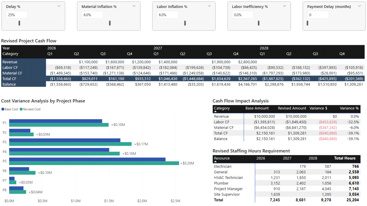
Cash Flow Impact Analysis (Matrix)
This matrix provides a compact comparison between baseline and scenario outcomes, showing absolute and percentage variances side by side.
Add a Matrix visual with DimCFCategories[CFCategory] on rows and the following measures as values: CF Value, CF Value (Scenario), CF Variance, and CF Variance %. Rename the value headers to Base Amount, Revised Amount, Variance $, and Variance %. Apply conditional formatting to the variance column so positive and negative movements are immediately visible.
Revised Staffing Hours Requirement (Matrix)
This view shows how staffing demand changes under the selected scenario assumptions.
Add a Matrix visual with DimResource[Resource] on rows and Calendar[Year] on columns. Use Time-Phased Labor Hours (Scenario) as the value. This highlights how delay and inefficiency increase labor demand even when the project scope remains unchanged.
Step 8b. Revised Project Timeline Page (Scenario Gantt)
Next, create a second page to visualise the revised project timeline under the current scenario settings. This page builds on the Gantt-style matrix introduced earlier, but now distinguishes between baseline schedule months and delay-driven extensions.
Create a new page called Revised Project Timeline. Add a Matrix visual with DimPhase[Phase] and DimActivity[ActivityName] on rows, and Calendar[Year] → Calendar[Quarter] → Calendar[MonthStart] on columns. Format MonthStart as MMM. Use Is Active (Month Scenario) as the value.
Apply conditional formatting (Format pane → Cell elements → Background/Font color) so value 1 uses a darker shade to represent baseline schedule months, and value 2 uses a lighter shade to represent delay extensions.
Sync slicers across pages
To ensure the Delay % slider controls both pages, select the Delay % slicer on the Scenario Planning page, open Sync slicers, and enable syncing for the Revised Project Timeline page. Other parameters only need to be synced if you want them to affect the timeline as well.
Step 8c. What-If Analysis
With the dashboard built, the final step is interpretation. Rather than testing arbitrary combinations of sliders, it’s more effective to define a small number of realistic scenarios and observe how risk compounds across timeline, cost, and cash flow.
Base Case – Approved Project Plan
The base case reflects the approved project plan with no adverse assumptions applied. Total project cost is $7.85m, split between approximately $1.4m of labor and $6.45m of materials, against expected revenue of $10m. The resulting margin of $2.15m is healthy, with the project completing in October of Year 3.
Because revenue is received through milestone payments, the project requires peak working capital of approximately $1.5m in the early quarters. Under the base plan, this requirement is manageable and short-lived.
Schedule Slippage and Cost Inflation (Scenario 1)
This scenario introduces a 25% schedule delay, extending project duration and increasing labor hours proportionally. At the same time, labor and material inflation are both set to 6%, increasing unit costs.
Although payment timing is unchanged, higher cumulative costs reduce the margin to approximately $1.4m. Peak working capital increases slightly to just under $1.6m, driven by higher expenditure rather than delayed receipts. The project remains viable, but with a noticeably thinner buffer.
Schedule Delay with Labor Inefficiency (Scenario 2)
This scenario builds on Scenario 1 and reflects the configuration shown in the Scenario Planning dashboard preview. A 20% labor inefficiency factor is introduced, increasing total labor hours without extending the timeline further.
The additional labor cost reduces margin to approximately $940k, while peak working capital remains just below $1.6m, as payment timing is still unchanged. More than half of the original margin has now been consumed.
Compounded Delay and Payment Timing Risk (Scenario 3)
The final scenario combines multiple adverse factors. The Delay % increases to 50%, and milestone payments are delayed by six months, directly affecting cash inflows.
Margin falls to just under $500k, eroding more than 75% of the original buffer. Delayed revenue drives peak working capital up to approximately $3.3m, with the project remaining cash-negative through the first three quarters before payments begin to offset costs.
This final scenario highlights a key insight: while schedule pressure erodes profitability, payment delays are what fundamentally reshape working capital risk and financing requirements.
📌 Recap: Building a Project Planning & Cost Management Dashboard in Microsoft Power BI
Here’s a quick recap of the steps required to build a complete project planning and cost management dashboard in Microsoft Power BI:
- Import and validate the project planning data. Load construction activities, resources, labor rates, material costs, and payment milestones, then review data types and structure to establish a clean analytical foundation.
- Build a dynamic project calendar. Create a DAX-driven Calendar table with an extended planning horizon to support both baseline schedules and future scenario extensions.
- Design a clean project data model. Structure the model around activities, phases, resources, and milestones using a star-schema approach to ensure predictable behaviour across timeline, cost, and scenario analysis.
- Define baseline cost and quantity measures. Create core DAX measures for labor cost, material cost, total project cost, and time-phased quantities to support project cost management analysis.
- Add resource and cash-flow logic. Extend the model with time-phased labor hours, cash-flow measures, cumulative cash balance calculations, and a unified cash-flow category dimension.
- Build the project plan and cost overview dashboards. Create cost summaries, annual breakdowns, staffing requirement visuals, and a Gantt-style project timeline using native Power BI visuals.
- Introduce scenario planning and sensitivity analysis. Add What-If parameters for delay, inflation, inefficiency, and payment timing, then build scenario-aware DAX to analyse revised timelines, costs, margins, and working capital.
- Run scenario testing and interpret risk. Use the dashboards and parameters to test realistic project scenarios and identify how schedule pressure, productivity loss, and payment delays affect profitability and cash-flow resilience.
By following these steps, you now have a flexible Power BI project planning model capable of analysing timelines, costs, resources, and cash flow under both baseline and scenario-driven conditions.
🔎 Preview the Interactive Project Planning & Cost Management Dashboard
Explore the finished Project Planning & Cost Management dashboard — the same model built in this tutorial. Adjust schedule delay, cost inflation, labor productivity, and payment timing assumptions, and immediately see the impact on project timeline, cost, margin, and working capital.
📥 Download My Project Planning & Cost Management Dashboard Template
To help you get started quickly, I’ve prepared a ready-to-use Power BI template that includes:
- A complete Power BI (.pbix) file with all project planning, cost, cash-flow, and scenario logic already built.
- CSV input files for activities, resources, labor rates, material costs, milestones, and calendar data.
- A full DAX measure library, structured and grouped exactly as shown throughout this tutorial.
This template allows you to adapt the model to your own projects, test cost and schedule risk, and perform structured scenario analysis without rebuilding everything from scratch.
Secure Checkout | Instant Download | 30-Day Money-Back Guarantee
Secure Checkout | Instant Download | 30-Day Money-Back Guarantee
Video Tutorial on Building a Power BI Project Planning & Costing Dashboard
My complete video tutorial explains how to build and customize a Project Planning & Cost Management dashboard in Microsoft Power BI, covering project timelines, cost tracking, forecasting logic, scenario planning, and sensitivity analysis.
In the video, you’ll learn:
- How to load and structure project planning and cost data in Power BI and build a clean, scalable data model.
- How to design and validate the core data model needed for timeline-based project reporting and cost management.
- How to write base DAX measures for project costs, progress tracking and summary reporting across key dashboard pages.
- How to convert a Power BI Matrix into a Gantt-style project plan using conditional formatting.
- How to use parameters and forecast DAX measures to run project plan scenarios and perform sensitivity analysis.
By the end of the tutorial, you’ll know how to build an end-to-end Power BI Project Planning & Costing dashboard that supports scheduling, cost management, forecasting, and scenario analysis in one integrated model.

Get in Touch
 Hi, I’m Jacek. I’m passionate about Microsoft Power BI, DAX, and analytical project and financial models.
I hope this tutorial helped you understand how to build a structured project planning and cost management dashboard with scenario analysis for timelines, cost, and cash flow.
If you’d like support with project modelling, scenario analysis, or Power BI dashboards, feel free to get in touch.
You can also explore more step-by-step tutorials, or check out my One-to-One Training and Data Analytics Support if you’d like personalised guidance.
Disclaimer: This tutorial is for informational and educational purposes only and should not be considered professional advice.
Explore More Tutorials
- Power BI Project Cost Allocation Dashboard Tutorial — Build a transparent project cost allocation model using allocation drivers, structured DAX, and interactive visuals.
- Power BI Project Financing and Revenue Recognition Tutorial — Learn about creating revenue recognition, debt forecasting, cash flow, returns, and credit metrics dashboard.
- Power BI Financial Planning & Analysis Dashboard Tutorial — Create a full FP&A model with forecasting, cash flow analysis, and scenario-driven financial planning.
- Project Finance Model – Excel Tutorial — Learn how to structure a full project finance model in Microsoft Excel, including cash flow, debt, and return analysis.
- Monthly Budget & Forecast – Excel Tutorial — Build a flexible monthly budgeting and forecasting spreadsheet with scenario-driven assumptions.