Last Updated on May 12, 2026
This tutorial walks through building a yield-focused Power BI dashboard for analyzing advertising inventory performance across campaigns and providers. You’ll learn how to structure data, create reusable DAX measures, and design visuals that support yield management, inventory monetization, and performance optimization.
We begin by loading and modelling campaign and inventory provider data, then build a core metric layer covering costs, conversion efficiency, and yield. From there, the tutorial introduces forward-looking yield forecast logic using What-If parameters, allowing you to simulate changes in conversion performance and inventory costs directly in Microsoft Power BI.
By the end of this guide, you will have a complete Power BI dashboard that combines historical inventory analysis with yield forecasting and variance analysis.
🔎 You can preview the interactive dashboard at the end of the tutorial to follow along.
Table of Contents
Step 1. Loading and Preparing Source Data for Inventory Yield Analysis
In this step, we’ll load and prepare the source data that underpins all inventory analysis and yield management in the dashboard. The goal is to ensure campaign, provider, and performance data are clean, consistent, and correctly typed. This keeps DAX measures simple, reliable, and reusable as we move into benchmarking, forecasting, and performance optimization.
1.1. Load Core Campaign and Inventory Datasets
We begin by loading the core datasets that underpin all yield management, inventory analysis, and benchmarking in the dashboard. These tables define the analytical grain of the model and establish the structure that all DAX measures will rely on later.
For this Yield Management and Inventory Analysis Dashboard, I used the following three source files:
- dim_campaign – defines the list of advertising campaigns included in the analysis. Campaigns represent distinct budget and optimization units and serve as the primary level for performance comparison, provider benchmarking, and scenario-based yield analysis.
- dim_inventory_provider – defines the third-party inventory providers supplying advertising traffic. This table enables side-by-side comparison of providers running the same campaigns and supports provider-level performance, cost, and yield benchmarking.
- fact_campaign_performance_monthly_2025 – contains monthly aggregated performance data at the Campaign × Inventory Provider level. It records traffic volume, performance outcomes, and economic inputs and outputs, which will later drive cost efficiency calculations, yield measurement, and forecast modelling.
Each file plays a distinct role in the data model. Keeping this separation between dimensions and facts will become especially important when we start building reusable DAX measures.
📥 You can download the source files and the completed Power BI dashboard file at the end of this tutorial.
To load the files into Microsoft Power BI, open Power BI Desktop and select Get Data → Text/CSV. Load each of the three CSV files, then choose Transform Data to open Power Query Editor. At this stage, the objective is simply to bring all tables into the model and confirm that Power BI has interpreted columns and data types correctly.
1.2. Cleaning and Shaping Campaign and Inventory Provider Data
With the files loaded, we can now prepare the data for modelling. The objective is to ensure consistency and reliability across the campaign and inventory provider tables before building relationships and DAX measures.
When loading dim_campaign and dim_inventory_provider, Microsoft Power BI may not automatically recognize the first row as column headers. If this occurs, select the table in Power Query Editor, go to Transform → Use First Row as Headers, and confirm that all column names are correct. While this step may seem minor, skipping it often leads to confusion later when defining relationships or referencing fields in DAX.
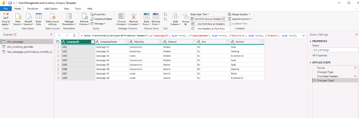
Before closing Power Query, take a moment to confirm data types across all tables. Date fields should be typed as Date, numeric metrics such as impressions, clicks, spend, and revenue should be stored as numeric values, and key identifiers should be consistent across dimension and fact tables. Once these checks are complete, select Close & Apply to load the cleaned data into the model.
Step 2. Building the Data Model for Campaign and Inventory Provider Analysis
With clean source data in place, we now ready to define the data model that supports campaign-level and inventory provider analysis. This step focuses on creating a controlled calendar table. It also establishes clear relationships so DAX measures calculate correctly across time, campaigns, and inventory sources.
2.1. Creating a Calendar Table Using DAX for Time-Based Yield Analysis
Instead of using Power BI’s automatic date hierarchy, we will create an explicit calendar table using DAX. This provides consistent time fields for monthly yield analysis, benchmarking, and forecasting.
In Model view, create a new table and enter the following DAX expression. The AUTOCALENDAR() function automatically generates a continuous date range based on the dates present in the model, while ADDCOLUMNS() allows us to enrich that table with year, month, and formatted attributes that will later be used in slicers, visuals, and calculations.
Calendar =
ADDCOLUMNS (
    AUTOCALENDAR (),
    "Year", YEAR ( [Date] ),
    "MonthNumber", MONTH ( [Date] ),
    "MonthName", FORMAT ( [Date], "MMM" ),
    "MonthYear", FORMAT ( [Date], "MMM YYYY" ),
    "MonthStart", DATE ( YEAR ( [Date] ), MONTH ( [Date] ), 1 )
)
Once the table is created, mark Calendar as a Date table using the Date column to enable correct time intelligence behavior in DAX.
2.2. Creating Relationships Between Campaign, Inventory, and Performance Data
With the calendar table in place, define the relationships that connect campaigns, inventory providers, and performance data. In Model view, create the following relationships:
- dim_campaign[CampaignID] → fact_campaign_performance_monthly_2025[CampaignID]
- dim_inventory_provider[InventoryProvider] → fact_campaign_performance_monthly_2025[InventoryProvider]
- Calendar[Date] → fact_campaign_performance_monthly_2025[MonthStart]
For each relationship, use one-to-many cardinality, set the cross-filter direction to single, and ensure the relationship is active. This structure ensures that campaign and provider slicers behave predictably and that DAX measures calculate correctly at the campaign × provider level.
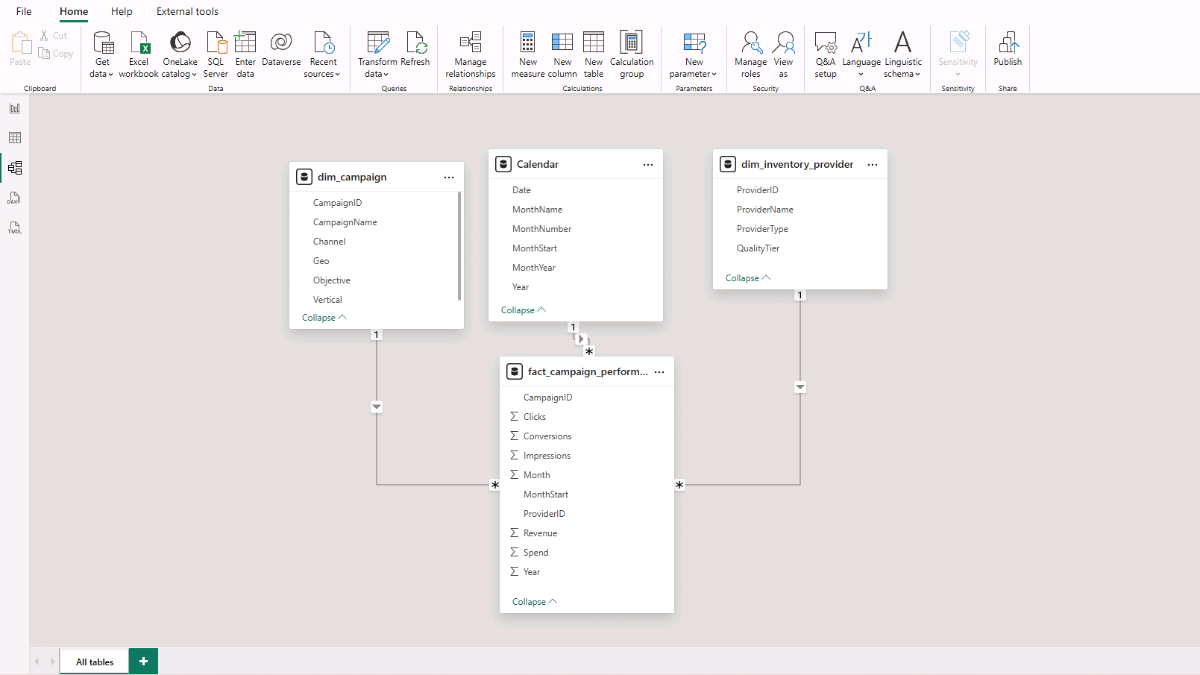
At this point, the core model is complete: a clean fact table, explicit campaign and inventory provider dimensions, and a controlled calendar table arranged in a star schema optimized for inventory analysis and yield management.
Step 3. Creating Core Yield and Inventory Performance Metrics with DAX
In this step, we build a focused set of DAX measures that work consistently across campaigns, inventory providers, and time. These measures support benchmarking and yield analysis later in the workflow.
To keep the model organized as the number of measures grows, let’s store all calculations in a dedicated measures table. In Power BI Desktop, go to Home → Enter Data, name the table Measures_Table, and click Load. For each calculation below, right-click Measures_Table and select New measure. Use a measure’s Display folder in Model view’s Properties to group related measures and keep the metric layer easy to navigate.
3.1. Base Total Measures for Inventory and Yield Analysis
We’ll start with a small set of base total measures. These measures aggregate raw performance and financial metrics from the fact table and form the foundation for all rates, cost metrics, yield calculations, and forecasts used throughout the dashboard.
Because filtering logic is handled by the data model relationships, these measures automatically respect campaign, inventory provider, and time selections without requiring additional DAX logic.
Impressions
Sums the total number of impressions delivered across the selected campaigns, inventory providers, and time period. Impressions represent traffic volume and act as the baseline denominator for multiple performance and yield metrics.
Impressions =
SUM ( fact_campaign_performance_monthly_2025[Impressions] )
Clicks
Totals all recorded clicks within the current filter context. Clicks support engagement analysis and act as the denominator for click-based efficiency metrics such as CTR, CPC, and click-to-conversion rates.
Clicks =
SUM ( fact_campaign_performance_monthly_2025[Clicks] )
Conversions
Counts the total number of conversions recorded. Conversions represent the primary performance outcome and are used across cost efficiency, yield, and profitability analysis.
Conversions =
SUM ( fact_campaign_performance_monthly_2025[Conversions] )
Spend
Calculates total advertising spend across the selected filter context. Spend represents the cost input for all efficiency, yield, and profit-based measures.
Spend =
SUM ( fact_campaign_performance_monthly_2025[Spend] )
Revenue
Calculates total revenue generated from conversions. Revenue forms the foundation for monetization, yield efficiency, and profitability metrics.
Revenue =
SUM ( fact_campaign_performance_monthly_2025[Revenue] )
Recommended formatting
Impressions, Clicks, Conversions: Whole numbers
Spend, Revenue: Currency
3.2. Core Rate Measures for Inventory Performance Analysis (DAX)
These core rate measures convert totals into comparable performance signals across campaigns and inventory providers. In this dashboard, we use DIVIDE() instead of direct division to avoid divide-by-zero errors and keep visuals clean.
CTR
Calculates click-through rate by dividing clicks by impressions. CTR is a top-of-funnel indicator and is most useful for comparing inventory providers on engagement efficiency at the impression level.
CTR =
DIVIDE ( [Clicks], [Impressions] )
CVR (Click to Conversion)
Calculates conversion rate per click, isolating post-click performance for comparing inventory provider quality.
CVR (Click to Conversion) =
DIVIDE ( [Conversions], [Clicks] )
Conv Rate (Impression to Conversion)
Measures end-to-end conversion efficiency per impression, useful for identifying inventory providers that drive conversions efficiently at scale.
Conv Rate (Impression to Conversion) =
DIVIDE ( [Conversions], [Impressions] )
Conversions per 100 Impressions
Scales end-to-end conversion efficiency to a per-100-impression basis, expressed in a format that’s easier to benchmark and compare across inventory providers.
Conv per 100 Impressions =
DIVIDE ( [Conversions], [Impressions] ) * 100
Recommended formatting
CTR, CVR, Conv Rate: Percentage (2 decimals usually reads well)
Conv per 100 Impressions: Decimal number (2 decimals usually reads well)
3.3. Effective Cost Measures for Inventory and Yield Analysis (DAX)
Effective cost measures translate spend into comparable efficiency signals across campaigns and inventory providers. These metrics make it possible to benchmark providers with very different traffic volumes by normalizing cost against clicks, conversions, or impressions.
CPC (Cost per Click)
Calculates the average cost per click, used to evaluate how efficiently inventory providers generate engagement.
CPC =
DIVIDE ( [Spend], [Clicks] )
CPA (Cost per Acquisition)
Calculates the average cost per conversion, directly linking spend to outcomes for yield management.
CPA =
DIVIDE ( [Spend], [Conversions] )
CPM (Cost per 1,000 Impressions)
Calculates the cost per thousand impressions, used to compare raw inventory costs across providers independent of performance.
CPM =
DIVIDE ( [Spend], [Impressions] ) * 1000
Recommended formatting
CPC, CPA: Currency
CPM: Currency (2 decimals typically reads well)
3.4. Yield and Inventory Monetization Measures (DAX)
Yield and monetization measures shift the analysis from cost efficiency to value creation. While cost metrics explain how much inventory costs, yield metrics explain how effectively that inventory is monetized and whether it contributes positively to overall performance.
ROAS (Return on Ad Spend)
Calculates revenue generated per unit of spend, used to evaluate monetization efficiency across campaigns and inventory providers.
ROAS =
DIVIDE ( [Revenue], [Spend] )
Profit
Derives absolute economic contribution by subtracting spend from revenue, showing whether inventory adds value beyond efficiency metrics.
Profit =
[Revenue] - [Spend]
Profit Margin
Measures the proportion of revenue retained after costs, useful for comparing yield quality across providers with different cost and revenue profiles.
Profit Margin =
DIVIDE ( [Profit], [Revenue] )
RPM (Revenue per 1,000 Impressions)
Calculates revenue per thousand impressions, linking traffic volume directly to revenue yield.
RPM (Revenue per 1K Impressions) =
DIVIDE ( [Revenue], [Impressions] ) * 1000
RPA (Revenue per Conversion)
Calculates average revenue per conversion, useful for assessing value per outcome alongside CPA.
RPA (Revenue per Conversion) =
DIVIDE ( [Revenue], [Conversions] )
Recommended formatting
ROAS: Decimal (2 decimals)
Profit: Currency
Profit Margin: Percentage
RPM, RPA: Currency
3.5. Provider Benchmarking and Ranking Measures (DAX)
Benchmarking helper measures make relative performance explicit by ranking inventory providers against each other within the current filter context. These measures translate efficiency and yield metrics into clear, comparable positions while remaining stable even if provider names change.
All ranking measures use RANKX() in combination with ALLSELECTED() over the provider key. This ensures rankings remain correct when slicers are applied and avoids issues caused by duplicate or renamed provider labels.
Provider Rank by CPA (Lowest Is Best)
Ranks inventory providers by cost per acquisition, with lower values ranked higher.
Provider Rank by CPA =
RANKX (
    ALLSELECTED ( dim_inventory_provider[ProviderID] ),
    [CPA],
    ,
    ASC,
    Dense
)
Provider Rank by CVR (Highest Is Best)
Ranks inventory providers by click-to-conversion rate, with higher values ranked higher.
Provider Rank by CVR =
RANKX (
    ALLSELECTED ( dim_inventory_provider[ProviderID] ),
    [CVR (Click to Conversion)],
    ,
    DESC,
    Dense
)
Provider Rank by ROAS (Highest Is Best)
Ranks inventory providers by return on ad spend, with higher values ranked higher.
Provider Rank by ROAS =
RANKX (
    ALLSELECTED ( dim_inventory_provider[ProviderID] ),
    [ROAS],
    ,
    DESC,
    Dense
)
Provider Rank by Conversions per 100 Impressions (Highest Is Best)
Ranks inventory providers by end-to-end conversion efficiency, with higher values ranked higher.
Provider Rank by Conv per 100 Impr =
RANKX (
    ALLSELECTED ( dim_inventory_provider[ProviderID] ),
    [Conv per 100 Impressions],
    ,
    DESC,
    Dense
)
Recommended formatting
Ranking measures: Whole numbers (no decimals)
Step 4. Inventory Overview and Performance Analysis Dashboard
In this step, we will translate the data model and DAX measures into an interactive dashboard focused on inventory performance and yield analysis. The report pages emphasize historical performance, cost efficiency, and monetization outcomes, providing a clear operational view and enabling direct comparison across campaigns and inventory providers.
4.1. Inventory Performance Overview Dashboard
a. Main Yield and Performance Indicators
This first visual provides a summary of key financial, efficiency, and yield metrics and serves as the primary performance snapshot for the dashboard.
Select the Report view in Microsoft Power BI Desktop. From the top ribbon, open the Insert tab and select Card (new) from the Visual gallery. Add the Spend, Revenue, Profit, CPA, RPA (Revenue per Conversion), and ROAS measures to the card. Use the Format pane to adjust layout, callout values, background, and font colors so the KPIs are clearly readable and evenly spaced.
b. Campaign Filter
The campaign filter allows you to limit the analysis to one or more selected campaigns and acts as the primary control for the page.
Insert a Slicer visual and assign dim_campaign[CampaignName] as the field. In the Format pane, switch on the slicer header and set the slicer style to Dropdown.
c. Spend, Revenue, and Conversions Chart
This visual shows how spend, revenue, and conversions evolve over time, making it easier to spot trends and performance changes across months.
Insert a Line and clustered column chart. Add Calendar[MonthStart] to the X-axis, Spend and Revenue to the column Y-axis, and Conversions to the line Y-axis. If necessary, right-click a field name to rename it, then remove unnecessary axis titles and adjust legend formatting using the Format pane.

d. Conversion Rate, CPA, and Impressions by Inventory Provider
This chart compares inventory providers across efficiency and scale in a single view, combining cost, conversion efficiency, and volume.
Insert a Scatter chart and assign CPA to the X-axis, Conv per 100 Impressions to the Y-axis, dim_inventory_provider[ProviderName] to the legend, and Impressions to the Size field. Enable category labels so provider names appear next to each data point.
e. Spend by Inventory Provider
This visual shows how total advertising spend is distributed across inventory providers, helping identify concentration and diversification patterns.
Insert a Treemap and assign dim_inventory_provider[ProviderName] and Spend to the visual. Enable data labels so relative spend allocation is visible without additional interaction.
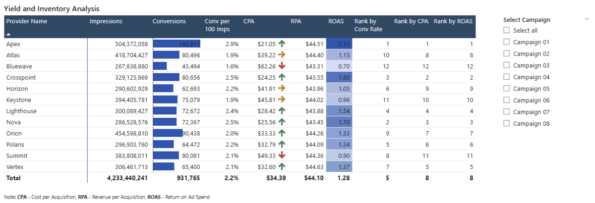
4.2. Yield and Inventory Performance Analysis Report
This report page delivers deeper inventory-level analysis by combining performance metrics, yield measures, and provider rankings in a single view. It supports side-by-side provider comparison and helps identify which inventory sources drive the most efficient and profitable outcomes.
a. Summary by Provider
This matrix provides a consolidated view of inventory provider performance, combining volume, efficiency, yield, and ranking metrics in a single table. It is the primary tool for comparing providers within the selected campaign and time context.
In the Report view, insert a Matrix visual. Add dim_inventory_provider[ProviderName] to the rows, then add Impressions, Conversions, Conv per 100 Impressions, CPA, RPA (Revenue per Conversion), ROAS, Provider Rank by Conv per 100 Impr, Provider Rank by CPA, and Provider Rank by ROAS to the values. If necessary, right-click field names to rename them and keep column headers concise and readable.
To highlight patterns and outliers, apply conditional formatting using the Cell elements section in the Format pane. Enable data bars for Conversions, icon-based formatting for CPA, and background color formatting for ROAS. Adjust rules and color scales so strong and weak performers are visually distinct without overwhelming the table. Finally, format column headers to improve contrast and readability.
b. Campaign Selector
The campaign selector allows you to focus the provider analysis on one or more specific campaigns.
Insert a Slicer visual and assign dim_campaign[CampaignName] as the field. Set the slicer style to a Vertical list and enable the Select all option so users can quickly switch between individual campaigns and the full dataset. Use one of the ranking columns to sort providers by the metric most relevant to your analysis.
Step 5. Yield Performance and Inventory Cost Forecasting in Microsoft Power BI
So far, the dashboard shows historical campaign and inventory provider performance. In this step, we add What-If parameters (external link) that let users simulate changes in conversion efficiency and inventory costs to assess their impact on yield, profitability, and provider rankings.
5.1 What-If Parameters
What-If parameters allow users to test assumptions without modifying the underlying data. They make it possible to compare current performance against hypothetical scenarios while keeping the model transparent and reproducible.
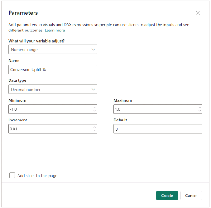
5.2 Create Conversion and Cost Uplift Parameters
To simulate changes in conversion efficiency, create a numeric What-If parameter. In Power BI Desktop, go to Modeling → New parameter → Numeric range and configure it with the following settings: data type Decimal number, minimum –1.0, maximum 1.0, increment 0.01, and default 0. Uncheck Add slicer to this page, as we will add the sliders later.
Name the parameter Conversion Uplift %. The generated value represents a relative change in conversion efficiency, where positive values indicate improvement and negative values indicate decline.
Repeat the same process to create a second parameter named Cost Inflation %, using the same configuration settings. This parameter will later be used to simulate changes in inventory costs.
5.3 Create Provider-Aware Forecast Multipliers
Before adjusting any metrics, create two helper measures that convert parameter values into usable multipliers. These measures keep forecast logic readable and reusable across multiple calculations.
Conversion Multiplier =
1 + [Conversion Uplift % Value]
The conversion multiplier applies the selected uplift or decline uniformly across all conversion-based measures.
Cost Multiplier =
1 + [Cost Inflation % Value]
The cost multiplier applies the selected cost change consistently across spend-related measures.
5.4 Key Forecast Measures
With the multipliers in place, apply them to the baseline measures to create forecasted equivalents.
Forecast Conversions =
[Conversions] * [Conversion Multiplier]
Forecast conversions adjust baseline conversions based on the selected conversion uplift or decline.
Forecast Spend =
[Spend] * [Cost Multiplier]
Forecast spend adjusts baseline spend based on the selected cost inflation or discount, while preserving the original provider mix and volume assumptions.
5.5 Forecast Efficiency Measures
Recalculate key efficiency metrics using forecasted values so that performance comparisons remain internally consistent.
Forecast CPA =
DIVIDE ( [Forecast Spend], [Forecast Conversions] )
Forecast Conv per 100 Impressions =
DIVIDE ( [Forecast Conversions], [Impressions] ) * 100
Forecast CTR =
DIVIDE ( [Clicks], [Impressions] )
Forecast CVR (Click to Conversion) =
DIVIDE ( [Forecast Conversions], [Clicks] )
In this scenario, impressions and clicks remain unchanged. The forecast isolates the impact of conversion efficiency and cost changes without introducing traffic volume assumptions. Impression- or click-based uplift logic can be added later if needed.
5.6 Forecast Revenue and Yield
Extend forecasting into revenue and yield metrics by applying the conversion multiplier to revenue and recomputing yield measures accordingly.
Forecast Revenue =
[Revenue] * [Conversion Multiplier]
Forecast ROAS =
DIVIDE ( [Forecast Revenue], [Forecast Spend] )
Forecast Profit =
[Forecast Revenue] - [Forecast Spend]
Forecast Inventory Monetization and Margin Metrics
These measures extend the forecast logic into inventory monetization and profitability. They mirror the actual RPM, RPA, and profit margin measures, ensuring forecast and actual metrics remain directly comparable in variance analysis.
Forecast RPM =
DIVIDE ( [Forecast Revenue], [Impressions] ) * 1000
Forecast RPA =
DIVIDE ( [Forecast Revenue], [Forecast Conversions] )
Forecast Profit Margin =
DIVIDE ( [Forecast Profit], [Forecast Revenue] )
Recommended formatting
Forecast RPM, Forecast RPA: Currency
Forecast Profit Margin: Percentage
Step 6. Yield Forecast and Variance Analysis Dashboard
With forecast measures in place, this step calculates variance metrics between forecasted and actual performance and uses them to build a yield-focused forecast and variance analysis dashboard. The goal is to show forecast impact by quantifying differences from the baseline in relative, percentage-point, and absolute terms.
6.1. Forecast vs. Actual Percentage Variance Measures
These variance measures compare baseline and scenario performance across the yield forecast dashboard and help assess sensitivity across metrics with different scales.
Conversions / Spend / Revenue / Profit
Conversions Var %
Divides forecasted conversions by actual conversions and subtracts 1 to express the relative change.
Conversions Var % =
DIVIDE ( [Forecast Conversions], [Conversions] ) - 1
Spend Var %
Compares forecasted spend to actual spend by dividing the two values and subtracting 1.
Spend Var % =
DIVIDE ( [Forecast Spend], [Spend] ) - 1
Revenue Var %
Divides forecasted revenue by actual revenue to show the relative difference from baseline.
Revenue Var % =
DIVIDE ( [Forecast Revenue], [Revenue] ) - 1
Profit Var %
Measures the relative change in profit by dividing forecasted profit by actual profit and subtracting 1.
Profit Var % =
DIVIDE ( [Forecast Profit], [Profit] ) - 1
Recommended formatting
Percentage (1–2 decimals)
Yield metrics (ROAS, RPM, RPA, Profit Margin)
ROAS Var %
Divides forecast ROAS by actual ROAS and subtracts 1 to show the relative change in return on ad spend.
ROAS Var % =
DIVIDE ( [Forecast ROAS], [ROAS] ) - 1
RPM Var %
Compares forecast and actual revenue per thousand impressions using a relative percentage change.
RPM Var % =
DIVIDE ( [Forecast RPM], [RPM (Revenue per 1K Impressions)] ) - 1
RPA Var %
Divides forecast revenue per conversion by the actual value to quantify relative change.
RPA Var % =
DIVIDE ( [Forecast RPA], [RPA (Revenue per Conversion)] ) - 1
CPA Var %
Expresses the relative change in cost per acquisition by dividing forecast CPA by actual CPA and subtracting 1.
CPA Var % =
DIVIDE ( [Forecast CPA], [CPA] ) - 1
Profit Margin Var %
Divides forecast profit margin by actual profit margin to show the relative difference.
Profit Margin Var % =
DIVIDE ( [Forecast Profit Margin], [Profit Margin] ) - 1
Conv per 100 Impressions Var %
Compares forecast and actual end-to-end conversion efficiency using a relative percentage change.
Conv per 100 Impressions Var % =
DIVIDE ( [Forecast Conv per 100 Impressions], [Conv per 100 Impressions] ) - 1
Recommended formatting
Percentage (1–2 decimals)
6.2. Forecast vs. Actual Percentage-Point Delta Measures
Percentage-point deltas compare forecast and actual performance for rate-based metrics where absolute differences are more meaningful than relative percentages.
Profit Margin (percentage points)
Profit Margin Δ (pp)
Subtracts actual profit margin from the forecast value to show the absolute change in percentage points.
Profit Margin Δ (pp) =
[Forecast Profit Margin] - [Profit Margin]
CTR Δ (pp)
Computes the percentage-point difference between forecast and actual click-through rate.
CTR Δ (pp) =
[Forecast CTR] - [CTR]
CVR (Click to Conversion) Δ (pp)
Subtracts the actual click-to-conversion rate from the forecast rate to show the absolute change.
CVR (Click to Conversion) Δ (pp) =
[Forecast CVR (Click to Conversion)] - [CVR (Click to Conversion)]
Conv per 100 Impressions Δ (pp)
Calculates the percentage-point difference in end-to-end conversion efficiency between forecast and actual values.
Conv per 100 Impressions Δ (pp) =
[Forecast Conv per 100 Impressions] - [Conv per 100 Impressions]
Recommended formatting
Percentage (show as percentage points)
6.3. Forecast vs. Actual Absolute Delta Measures
Absolute deltas show the raw difference between forecasted and actual values. These measures work well in tables and KPI cards alongside percentage variance metrics.
Conversions Δ =
[Forecast Conversions] - [Conversions]

Spend Δ =
[Forecast Spend] - [Spend]

Revenue Δ =
[Forecast Revenue] - [Revenue]

Profit Δ =
[Forecast Profit] - [Profit]

ROAS Δ =
[Forecast ROAS] - [ROAS]

RPM Δ =
[Forecast RPM] - [RPM (Revenue per 1K Impressions)]

RPA Δ =
[Forecast RPA] - [RPA (Revenue per Conversion)]

Profit Margin Δ =
[Forecast Profit Margin] - [Profit Margin]
6.4. Yield and Performance Forecast and Variance Analysis Dashboard
This report page brings forecast values and variance metrics together to support scenario-driven yield analysis at the inventory provider and campaign level.
a. Campaign Selector and Parameter sliders
This section introduces the controls used to drive forecast scenarios. In the Report view, insert a Slicer for dim_campaign[CampaignName] and set it to Dropdown. Then add two parameter slicers using the automatically generated fields for Conversion Uplift % and Cost Inflation %. These sliders allow users to adjust forecast assumptions interactively.
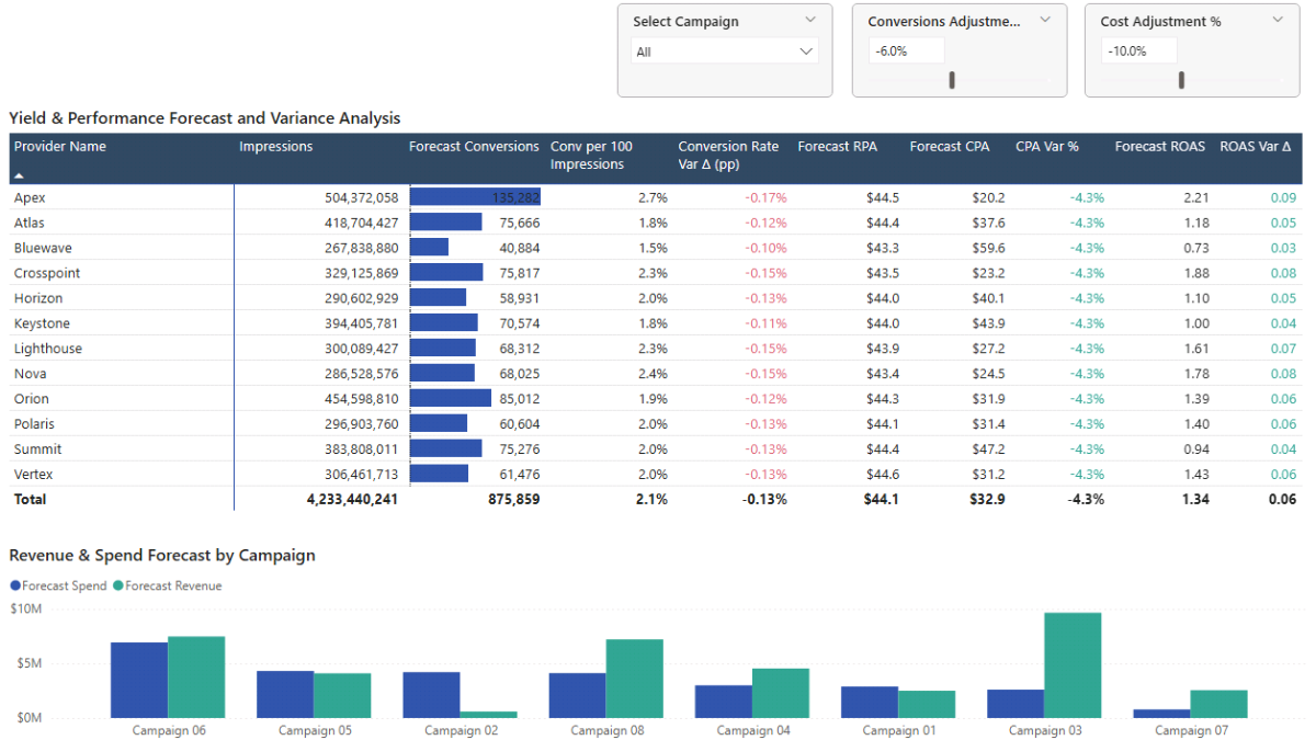
b. Inventory and Yield Forecast and Variance Analysis
This matrix compares forecasted performance against actuals at the inventory provider level. Insert a Matrix visual and add dim_inventory_provider[ProviderName] to the rows. Add the following measures to the values: Impressions, Forecast Conversions, Forecast Conv per 100 Impressions, Conv per 100 Impressions Δ (pp), Forecast RPA, Forecast CPA, CPA Var %, Forecast ROAS, and ROAS Δ.
Enable Font color under the Format pane’s Cell elements for Conv per 100 Impressions Δ (pp), CPA Var %, and ROAS Δ. Use rule-based formatting to apply green to positive values and red to negative values. Format column headers to improve contrast and readability.
c. Revenue & Spend Forecast by Campaign
This chart shows how forecasted revenue and spend vary across campaigns under the selected scenario. Insert a Clustered bar chart and add dim_campaign[CampaignName] to the axis. Add Forecast Spend and Forecast Revenue as values. Rename fields for clarity and adjust legend and title formatting using the Format pane.
d. Interaction settings
By default, selecting campaigns in the slicer filters all visuals on the page. You can also select campaigns directly in the bar chart to apply the same filter.
If you want the bar chart to remain unfiltered and act as a benchmark, disable its interaction with the campaign slicer. Select the campaign slicer, open the Format tab, choose Edit interactions, and set the bar chart interaction to None using the icon in the visual’s upper-right corner.
6.5. What-If Scenarios and Sensitivity Analysis for Yield Management
With forecasting parameters in place, the dashboard shifts from descriptive reporting to yield-focused analysis. This section uses a small set of consistent scenarios to stress-test inventory performance and identify providers that sustain yield under changing conditions.
Each scenario applies the same two controls: Cost Inflation %, representing changes in inventory cost, and Conversion Uplift %, representing changes in conversion efficiency. Reviewing the forecast-versus-actual variance table shows how yield responds to cost and performance changes.
Scenario 1: Cost increase (yield under pressure)
Set Cost Inflation % to +10% and keep Conversion Uplift % at 0%. This scenario isolates cost pressure while holding conversion efficiency constant. The key question is whether the current yield profile can absorb higher inventory costs without breaking profitability or pushing CPA beyond acceptable limits.
Scenario 2: Cost decrease with loss of performance
Set Cost Inflation % to –6% and set Conversion Uplift % to –10%. This scenario reflects a common tradeoff in inventory monetization: cheaper traffic that converts less efficiently. The key question is whether the cost reduction is large enough to offset the performance loss and still improve overall yield, especially at the provider level. This scenario is preconfigured in the dashboard preview.
Scenario 3: Cost increase offset by performance gains
Set Cost Inflation % to +10% and set Conversion Uplift % to +8%. This scenario tests whether paying more for inventory is justified when conversion efficiency improves. The key question is whether improved performance can maintain or improve ROAS and profit despite higher costs, and which providers benefit most from this tradeoff.
📌 Recap: Building a Power BI Yield Management & Inventory Analysis Dashboard
Here’s a quick recap of the main steps required to build a complete yield management and inventory analysis dashboard in Microsoft Power BI:
- Load and prepare the source data. Import the campaign, inventory provider, and monthly performance tables, then validate headers and data types so the model stays reliable for inventory performance and yield analysis.
- Build the Calendar table and data model. Create a DAX Calendar table, mark it as a date table, and define clean one-to-many relationships so time and slicers filter correctly across campaigns, providers, and monthly performance.
- Create core DAX measures for yield and inventory performance. Build a structured measure layer for totals, rates, effective costs, yield/monetization metrics, and provider benchmarking ranks that work at campaign and provider level.
- Build the inventory performance report pages. Create a Performance Overview dashboard and a Yield & Inventory Analysis report to compare providers, validate yield metrics, and identify performance drivers across campaigns.
- Add yield forecasting with What-If parameters. Create conversion uplift and cost inflation parameters, then build forecast measures for conversions, spend, revenue, ROAS, and profit to support forward-looking yield management.
- Build the yield forecast and variance analysis dashboard. Add variance measures (% variance, percentage-point deltas, and absolute deltas) and consolidate the scenario controls and forecast-vs-actual reporting into a single decision-focused report page.
By following these steps, you now have a Power BI model that connects inventory performance, yield metrics, forecasting controls, and variance analysis into a single dashboard for provider benchmarking and scenario testing.
🔎 Preview the Interactive Yield Management & Inventory Analysis Dashboard
Explore the finished Yield Management & Inventory Analysis dashboard — the same model built in this tutorial. Adjust conversion uplift and cost inflation assumptions, and immediately see the impact on provider efficiency, yield, ROAS, profit, and forecast variance.
📥 Download My Yield Management & Inventory Analysis Dashboard Template
To help you get started, I’ve prepared a ready-to-use Power BI template that includes:
- A complete Power BI (.pbix) file with inventory performance analysis, yield measures, provider benchmarking, forecasting parameters, and variance analysis already built.
- CSV input files for campaigns, inventory providers, monthly performance, and calendar setup.
- A full DAX measure library, structured and grouped exactly as shown throughout this tutorial.
This template lets you adapt the model to your own inventory sources, benchmark provider performance, forecast yield under cost/performance changes, and run structured sensitivity analysis without rebuilding the dashboard from scratch.
Secure Checkout | Instant Download | 30-Day Money-Back Guarantee
Secure Checkout | Instant Download | 30-Day Money-Back Guarantee
Get in Touch
 Hi, I’m Jacek. I’m passionate about Microsoft Power BI, DAX, and analytical dashboard models for performance optimization.
I hope this tutorial helped you understand how to build a structured yield management and inventory analysis dashboard with provider benchmarking, yield forecasting, and variance analysis.
If you’d like support with inventory monetization analytics, yield forecasting logic, or Microsoft Power BI dashboards, feel free to get in touch.
You can also explore more step-by-step tutorials, or check out my One-to-One Training and Data Analytics Support if you’d like personalised guidance.
Disclaimer: This tutorial is for informational and educational purposes only and should not be considered professional advice.
Explore More Tutorials
- Power BI Marketing Performance Forecast Dashboard — Build a marketing performance model with forecasting, targets, and variance analysis.
- Power BI Customer Churn & Revenue Forecast Tutorial — Create a churn and revenue forecasting model with DAX measures and interactive reporting.
- How to Create a Marketing Investment Plan (Excel Tutorial) — Structure a marketing investment plan to allocate budget and evaluate expected returns.
- How to Create a Subscription Model with Churn Calculation (Excel Tutorial) — Build a subscription revenue model with churn logic and retention assumptions.
- Excel Churn Retention Cohort Analysis — Create a cohort-based churn and retention analysis spreadsheet.